

Sweet Tooth
“Search for your dessert”

Fast Facts for Busy Reviewers
Goal:
Design a mobile app that helps people with dietary needs quickly find and order safe desserts from local bakeries, without guesswork.
Roles:
UX Research • UX Design
Team:
Yarisel, Valeria, Sana, Sean, Beth
Tools Used:
Figma • Miro • Trello • Google Forms
Key Insights:
Dietary profile and filters (sugar-free, vegan, gluten-free) are surfaced on the home screen for zero-hunt discovery.
“Order Again” shortcut enables one-tap reorders of past treats.
Clear pickup time and status reduce uncertainty from cart to collection.
Insights & Impact:
Lead with safe options based on a saved dietary profile.
Keep checkout short, one confirmation page with saved details.
Drive retention with Favorites, Order Again, and nearby bakery suggestions.
Explore the Work Behind the Design

The Challenge
Finding desserts that meet specific dietary needs can be frustrating and time-consuming. I know this firsthand, because that’s exactly how I felt when I discovered I was pre-diabetic. People with health conditions like diabetes, or dietary preferences such as veganism or gluten-free, often face limited options in their local bakeries, leaving them feeling left out of shared moments around food.
As part of a four-member design team, I poured my heart and soul into developing Sweet Tooth, a mobile application created to make dessert shopping easy, inclusive, and enjoyable for any dietary restriction by connecting users to bakeries that offer safe, personalized treats.

Problem
Many people struggle to find desserts that meet their dietary needs. The limited availability of suitable options often leads to frustration and dissatisfaction. This lack of accessibility makes it difficult for people to enjoy sweets without compromising their well-being.

Tools Used
To design, organize, and test the application, the following tools were used:
Figma
Miro
Trello
Google Forms

Key Insights
Research revealed clear patterns in user preferences and ordering habits that shaped Sweet Tooth’s design:
Dessert lovers want quick access to safe options without searching multiple menus.
Clear pickup times and reordering features encourage repeat purchases.
Design Suggestions
Display dietary filters up front (sugar-free, vegan, gluten-free)
Provide an “Order Again” shortcut
Include pickup status updates to build trust and convenience
Research Highlights
Before moving into design, I conducted thorough research to understand the dessert market, user challenges, and opportunities for innovation. Here’s what I discovered:
Competitive Analysis revealed gaps in dietary options, ingredient transparency, and tailored search filters in both direct and indirect competitors. By conducting marketing research on Chinese medicinal cuisine and food therapy, we discovered establishments that offer sweet treats catering to dietary restrictions.
User Interviews uncovered strong emotional ties to desserts, difficulties managing dietary restrictions, and high value placed on clear labeling and trusted reviews.
Survey Feedback confirmed the demand for quick access to safe options and the importance of a smooth reordering process.
🧁 Example: Competitor review showed that most dessert apps did not have a category for dietary restrictions, which became a key feature in Sweet Tooth.
🧁 Example: Interview participants emphasized wanting clear pickup times and dietary filters available from the first screen.

-
![Proto Persona: Bailey Sprinkles]()
Proto Persona: Bailey Sprinkles
Bailey Sprinkles, a 30-year-old from Alpharetta, GA, represents the ideal user for Sweet Tooth. Diagnosed with diabetes in childhood and having a child with the same condition, Bailey is passionate about finding new dessert places but often struggles with unreliable online searches. She values efficient recommendations for diabetic-friendly desserts and enjoys bonding over sweets with her family. Bailey’s persona helped shape the Sweet Tooth design by focusing on ingredient transparency, clear labeling, and community-based reviews to cater to her specific needs.
-
![Storyboard: Bailey Sprinkles]()
Storyboard: Bailey Sprinkles


Design Build
The design process moved from early sketches to fully interactive prototypes, guided by user feedback at every stage.
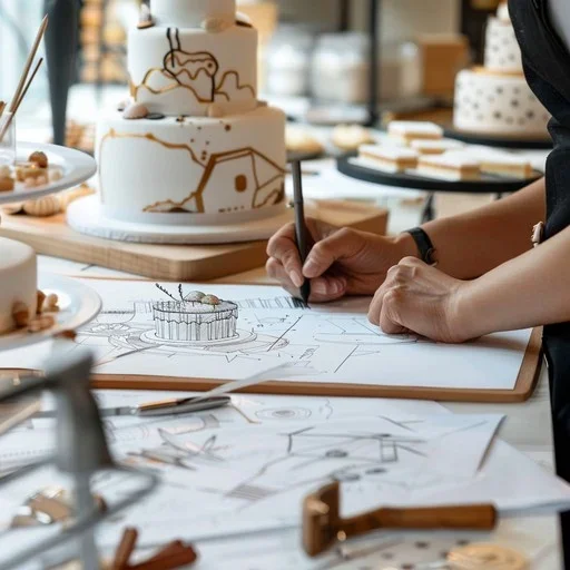
Sketches & Design Evolution
Early sketches mapped out key screens and user flows, including searching for desserts, viewing ingredient details, and completing purchases. Multiple layout variations were tested to find the clearest and most intuitive structure before moving forward.


To view the sketches in more detail, click here!
Low-Fidelity Wireframes
Using Figma, we built grayscale wireframes to map the app’s structure, layout, and navigation flow. This stage validated search, cart, and checkout paths while ensuring dietary filters were easy to find before moving into detailed design.
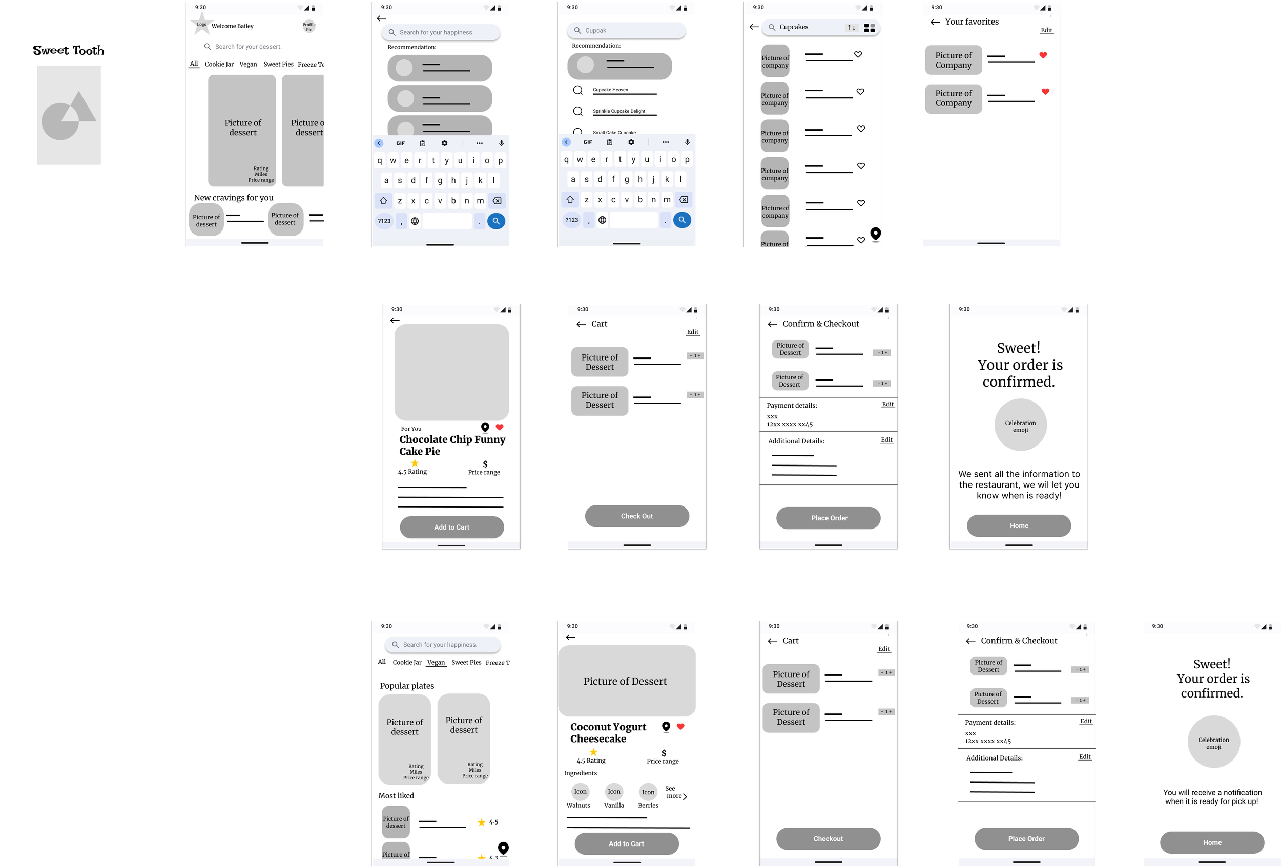
User Flow Analysis
We mapped the dessert-ordering journey from search to payment, focusing on actions like browsing, checking ingredients, and placing orders. Testing showed most flows worked well but revealed issues with finding specific desserts and ingredient clarity. These insights led to simpler navigation, clearer labeling, and an improved overall experience.

To view the User Flow in more detail, click here!
Usability Testing
We ran guerrilla usability tests to observe real user interactions and uncover pain points.
Key tasks tested:
Search for a dessert
Select the vegan tab and proceed to payment
Choose a dessert from the cravings option and complete checkout
Major finding: Users were confused by the search bar’s functionality.
Solution: Redesigned it with clear labels and visual cues, iterating three times until user comprehension improved in follow-up tests.
✅ Positive feedback: Clean vegan dessert page, simple navigation, smooth transitions.
🚫 Negative feedback: Confusing search use, navigation bar overflow, inconsistent fonts, no easy exit from search, and a “place order” button that sometimes failed.
Changes prioritized fixes that most users requested to ensure a smooth, reliable experience.
Key Visuals & What They Show
Collaborative Design Phase
In developing the final design for Sweet Tooth, we followed a fresh and inviting visual style to make the platform engaging and user-friendly. Based on guerrilla testing feedback, our team made key improvements:
Added back and cancel buttons
Removed the confusing speed checkout option
Simplified the home page for better navigation
We also incorporated features that responded directly to user needs:
Visually appealing search bar
“Like” button for desserts
Dedicated Vegan section
Ingredients page for transparency
Personalized “Craving for You” section based on search history
These changes encouraged users to explore new desserts while creating a seamless navigation flow.

Individual Contribution: Final Product
After the team challenge, I refined the Sweet Tooth app individually to enhance flow and intuitiveness. I applied Material Design guidelines, made further adjustments based on user feedback, and incorporated new learning resources to elevate the design.
Key refinements included:
Enhanced user flow for checkout
Refined button placement and hierarchy
Improved mobile visual consistency
Streamlined navigation between categories

From Insight to Final Delivery
• Personal Motivation
Inspired by my own journey managing blood sugar and overcoming pre-diabetes, Sweet Tooth was designed to let people enjoy desserts without sacrificing health. This project was both a personal mission and a professional challenge.
• Future Features
Plans include more personalized dessert recommendations based on dietary needs and user preferences, plus social features for sharing favorites and reviews.

• Partnership Opportunities
Form collaborations with local businesses to offer exclusive deals while keeping the user experience front and center.
• Dietary Expansion
Broaden the app’s offerings to support a wider range of dietary restrictions, ensuring more users can indulge guilt-free.
• Continuous Innovation
Leverage machine learning and stay ahead of industry trends to keep refining and enhancing the user experience.
• Growth as a Designer
Through this project, I strengthened skills in prototyping, wireframing, and design tools like Figma and Miro, improved collaboration, and refined my approach to user-centered design.