
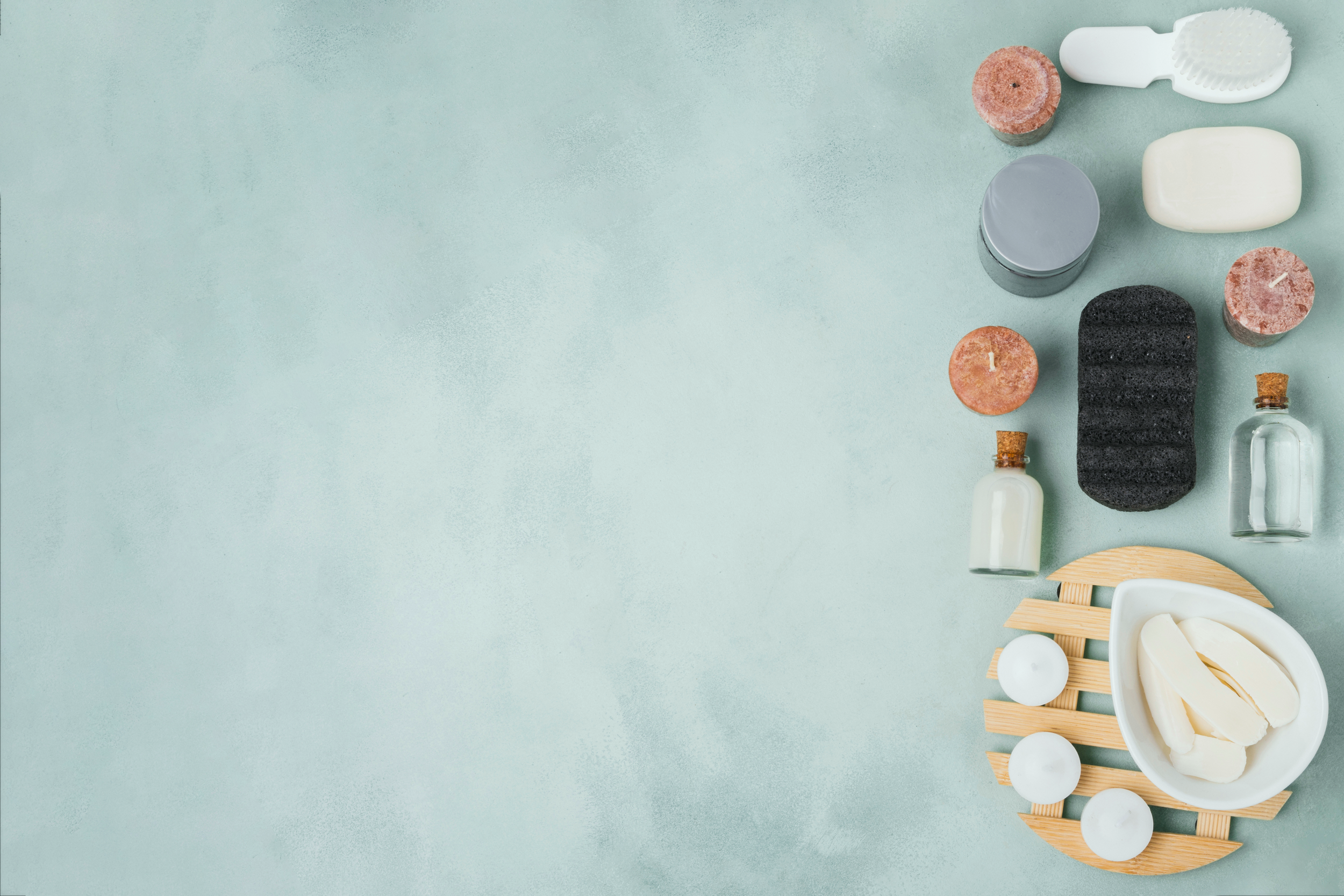
Waxing & Skincare by Juliana

Snapshot
Goal:
Redesign Juliana’s Waxing & Skincare website to improve user engagement, simplify navigation, and reflect a modern, professional brand identity.
Roles:
UX/UI Design • UX Research • Prototyping & Testing
Team:
Yarisel • Sean • Madi • Krissalys • Clariss
Tools Used:
Figma • Miro • Trello • Google Forms
Key Insights:
Modern brand alignment: Updated color scheme, fonts, and streamlined homepage for a polished, contemporary feel.
Simplified navigation: Clear paths to services, booking, and educational resources improved user flow.
Trust & credibility boost: Transparent pricing, testimonials, and educational content increased confidence in booking.
Insights & Impact:
Prioritize content clarity with concise homepage sections and consistent visual hierarchy.
Make booking frictionless by placing CTAs in high-visibility areas.
Support client retention with resources that reinforce Juliana’s expertise and premium positioning.
Explore the Design

The Challenge
In today’s competitive beauty market, a website is often the first impression clients have of a brand. For Juliana’s Waxing and Skincare, that first impression wasn’t reflecting the premium services and modern, relaxing experience offered in-person.
The outdated design, dense homepage content, and inconsistent font sizes made navigation frustrating, discouraging potential clients from exploring services or booking appointments. Our task was to bring the site in line with Juliana’s brand identity, keeping it professional, approachable, and client-focused, while making it easy for visitors to find the information they need.

Problem
Potential clients were struggling with:
A cluttered homepage that made finding key information difficult.
An outdated visual style and poor readability that didn’t match the spa’s high-end feel.
Navigation friction that could lead to lost bookings.

Tools Used
To design, organize, and test the updated site, we used:
Figma & FigJam
Miro
Trello
Google Forms & Fonts

Key Insights
Research highlighted clear user needs that shaped the redesign:
Users wanted quick, easy navigation to book services without scrolling through excessive content.
Clear pricing and transparent service descriptions increased trust and credibility.
Modern visuals and consistent typography improved perceived brand quality.

Design Suggestions
Streamline homepage content for faster access to booking.
Update color palette and typography for a fresh, modern feel.
Add transparent pricing and testimonials to build trust.
Research Highlights
Before moving into design, we conducted thorough research to understand Juliana’s brand, user needs, and opportunities for improvement. Here’s what we discovered:
Competitive Analysis revealed gaps in modern design, navigation simplicity, and inclusive branding across both direct and indirect competitors.
Stakeholder Interview clarified Juliana’s vision for a professional yet approachable site that reflects her expertise and builds trust.
Customer Survey showed a preference for clear navigation, transparent pricing, and consistent visual branding.
Example: Competitive review showed that many spa websites used overly feminine visuals that alienated male clients, influencing our inclusive design approach.
Example: Survey responses highlighted the importance of easy-to-scan service descriptions and a smooth booking process.

-
![Proto Persona: Mike Taylor]()
Proto Persona: Mike Taylor
Meet Mike Taylor, a 27-year-old software engineer in Orlando, FL. Mike spends most of his time at his computer and is eager to return to the dating scene. He values efficiency and seeks a knowledgeable waxer/esthetician with a fast, easy booking system. Nervous about waxing and with sensitive skin, Mike wants a quick process and tailored grooming tips. Understanding Mike's needs, Waxing and Skincare by Julianna can design a website that addresses his concerns and ensures a satisfying customer experience.
-
![User Persona: Tate Malone]()
User Persona: Tate Malone
Tate Malone, a 34-year-old software engineer from Orlando, seeks to improve his self-care routine but feels overwhelmed by the abundance of options. As a male seeking grooming services, he worries about potential discrimination. Tate's goals include receiving a facial, learning skincare techniques, and managing his facial hair. He enjoys podcasts, TikTok, running, and reading. Tate desires an inclusive platform that caters to his unique needs, providing informative guidance to help him navigate his self-care journey confidently.


Design Build
The design process moved from early sketches to fully interactive prototypes, guided by user feedback at every stage.
Customer Journey Map
We mapped the full customer experience from initial site visit to booking, highlighting drop-off points and moments of confusion. Insights revealed where users felt frustrated, such as unclear service descriptions and difficulty finding booking links.

To view the User’s Journey Map in more detail, click here!
Card Sorting Insights
We ran an open card sorting exercise to understand how clients grouped services and related information. The results showed users preferred organizing services by type (waxing, facials) rather than by body area, and wanted pricing alongside each category.

To view the Card Sorting in more detail, click here!
Low-Fidelity Blueprint
We created grayscale wireframes to test the new navigation, service pages, and booking flow. These low-fidelity prototypes validated the placement of menu items, pricing visibility, and CTA buttons before moving to full design.

To view Low-Fidelity Blueprint in more detail, click here!
UI Style Guide
The final style guide defined the visual identity, including typography, color palette, iconography, and component styles. This ensured brand consistency and made it easy for future updates to maintain the same professional, approachable feel.

To view the UI Style Guide in more detail, click here!

To view the UI Style Tile in more detail, click here!
We also created detailed wireframes for the Home Page and Service Page to validate navigation, content placement, and overall layout before moving into high-fidelity design. These helped confirm the visibility of core service offerings and booking options early in the process.
To view the Home Page wireframe in more detail, click here!
To view the Service page wireframe in more detail, click here!
Key Visuals & What They Show
Collaborative Design Phase
In developing the final design for Waxing and Skincare by Julianna, our team set out to build an engaging and user-friendly platform. Guided by valuable user feedback, we tackled key challenges to improve functionality and visual appeal across the site.
Key collaborative improvements included:
Enhancing the logo, color palette, and imagery for a cohesive look
Applying the “Z method” for more intuitive text and image placement
Refining the site’s layout for stronger visual hierarchy
Incorporating user-requested features for better navigation
These changes gave the website a more polished and professional feel while making it easier for users to find the information they needed.

Individual Contribution: Final Product
After the collaborative phase, I refined the design individually to expand functionality and improve the overall user experience. I incorporated further user testing, gathered feedback, and made strategic adjustments to elevate the design.
Key refinements included:
Adding new pages and components to increase functionality
Adjusting button placement and hierarchy for clarity
Improving visual consistency across devices
Presenting the final design to stakeholders to highlight the difference between web design and full UX/UI design

From Insight to Final Delivery

• User input is everything
Testing high-fidelity prototypes and working with the team showed how much user feedback shapes the final product. Even with time limits, refining the design on my own made the end result stronger.
• What’s next
Make the site fully mobile-friendly, add online booking, and create content that keeps people coming back. I’ll also set up analytics to track performance and guide updates.
• For future designers
Keep talking to your team. Put the user first. Use feedback at every step.
• Personal growth
This project helped me sharpen my communication, teamwork, and decision-making. I had to manage uneven workloads, make quick calls, and still keep the design goals on track.

• Challenges
A teammate didn’t deliver on their part, even after we discussed it. I had to reassign work and hold people accountable. It wasn’t easy, but it kept the project moving.
Explore the Work Behind the Design
For a more in-depth look at our research process, findings, and tools, please explore the following resources:
Explore the Design