

The Realm
Connect. Collaborate. Conquer.

Snapshot
Goal:
Design a user-friendly social platform for D&D and tabletop RPG fans that fosters community, strengthens engagement, and appeals to both new and experienced players.
Roles:
UX/UI Designer • UX Research • Collaboration • Interactive Elements • Visual Language • Project Delivery
Team:
Yarisel • Henry • Michael • Enrique
Tools Used:
Figma • Miro • Trello • Wix
Key Insights:
Community-first design: Built an interface that encourages both new and veteran players to connect, collaborate, and build friendships.
Interactive elements: Designed features that enhance player engagement and strengthen bonds across the community.
Cohesive visual language: Developed a vibrant, inclusive design system that feels immersive and welcoming.
Insights & Impact:
Create platforms where community is the core feature, not an afterthought.
Balance usability with immersive, thematic design to appeal to both casual and dedicated RPG fans.
Interactive, engaging visuals can turn a platform into a living community rather than just a tool.
Explore the Work Behind the Design


The Challenge
In today’s online world, community platforms thrive or fail based on how engaging and inclusive they feel. For The Realm, the challenge was to design a digital space where both new and experienced D&D and tabletop RPG players could connect, collaborate, and build lasting friendships.
The existing gap was that RPG communities often felt fragmented or catered only to experienced players, leaving newcomers struggling to engage. Our task was to create a user-friendly platform with intuitive navigation, interactive elements, and a cohesive visual identity, ensuring that players of all levels felt welcomed and inspired to participate.

Problem
Players were struggling with:
A lack of centralized, welcoming spaces for both new and veteran RPG players.
Interfaces that felt outdated, difficult to navigate, or uninviting.
Limited opportunities for interactive engagement that truly fostered community bonds.

Tools Used
To design, organize, and test the platform, we used:
Figma
Trello
Miro
Slack

Key Insights
Research and testing highlighted:
RPG players value intuitive, immersive interfaces that are quick to navigate.
Interactive elements (like collaboration features) boost engagement and create stronger community ties.
A vibrant, consistent visual language makes the platform feel alive, inclusive, and fun.

Design Suggestions
Build an intuitive interface that’s accessible for both casual and experienced players.
Add interactive elements to encourage collaboration and strengthen social bonds.
Apply a cohesive visual design system to create an inclusive and vibrant atmosphere.
Research Highlights
Before moving into design, we conducted thorough research to understand the needs of tabletop RPG players, identify gaps in existing platforms, and explore opportunities for improvement. Here’s what we discovered:
Competitive Analysis revealed gaps in player-matching, scheduling, and inclusive community features across platforms like Discord, Meetup, Gamerlink, and Tinder. These insights showed where The Realm could stand out by offering features designed specifically for RPG fans.
User Interviews clarified common frustrations such as difficulty finding reliable players, managing game sessions, and maintaining consistent group schedules. Players emphasized the need for stronger moderation, preference settings, and accessibility features.
Surveys highlighted clear user preferences for easy scheduling, reliable group discovery, and immersive design that feels welcoming to both new and experienced players.
Examples:
Competitive review showed that while apps like Meetup and Gamerlink offered basic chat and group features, they lacked RPG-focused tools and had poor moderation. This guided The Realm’s focus on safe, reliable community-building.
Survey responses revealed pain points like groups disbanding after a few sessions or difficulty finding consistent players, reinforcing the importance of features for long-term group stability.

-
![Proto Persona: Toshi Adams]()
Proto Persona: Toshi Adams
The design of the tabletop RPG platform was guided by understanding the needs of users like Toshi Adams, a 28-year-old tabletop RPG enthusiast seeking a platform for connection and skill development. The platform was designed to be accessible and user-friendly, with features that encourage community building, skill sharing, and a welcoming environment for all. Toshi's preferences and needs were kept in mind throughout the design process to ensure a seamless experience for users.
-
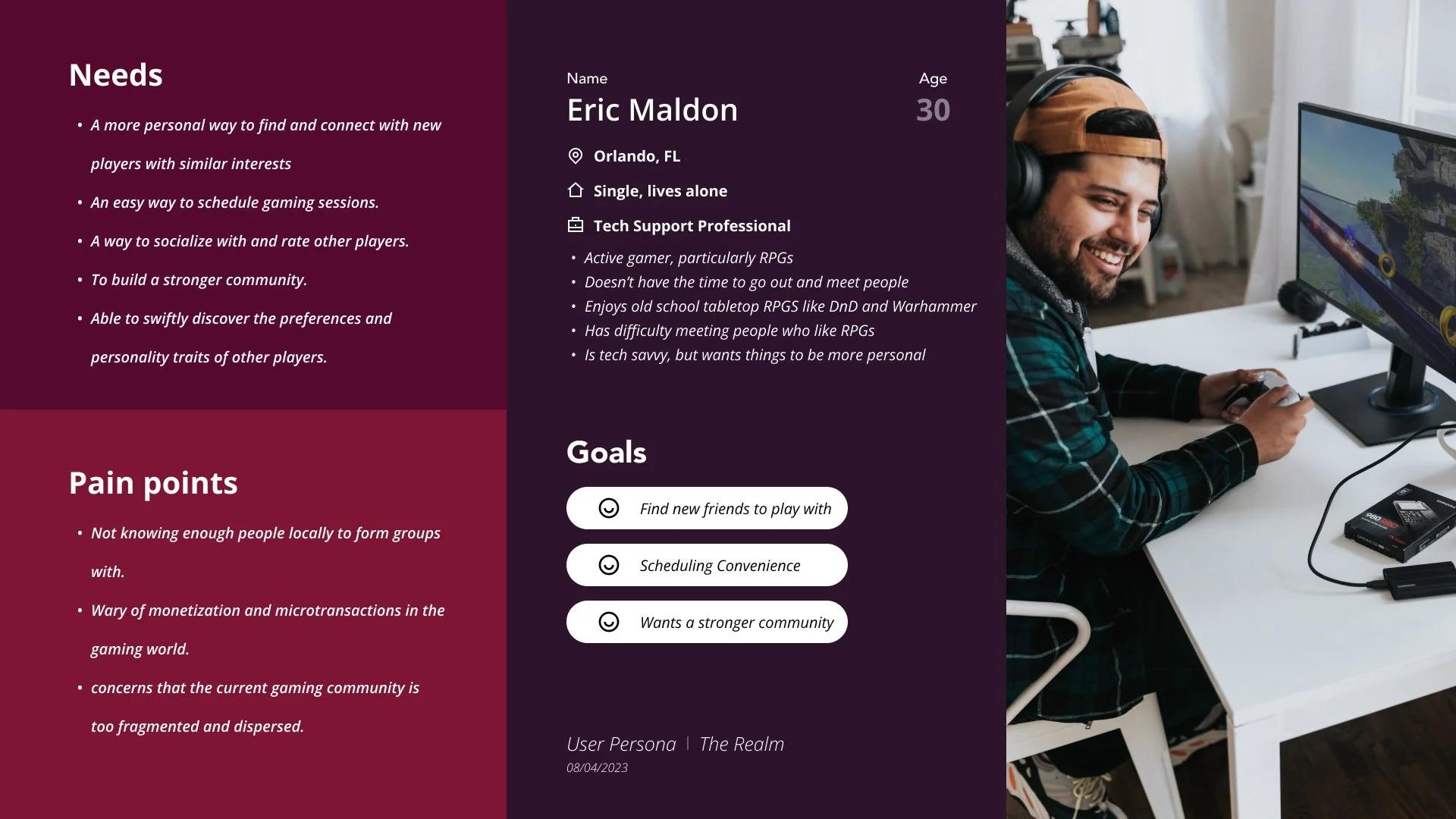
![User Persona: Eric Maldon]()
User Persona: Eric Maldon
We kicked off this journey by meticulously crafting profiles from the invaluable surveys we received. Allow me to introduce you to Eric Maldon, our trusted companion in the world of product development. Eric is more than just a persona; he's the heart and soul of our decision-making process. With his unique insights, we're dedicated to creating an experience that resonates deeply with Eric and others like him, putting their needs and desires at the center of our product's evolution.

Design Build
The Realm’s design journey moved from early storyboards to wireframes, flows, and high-fidelity prototypes. At each stage, we tested with players, gathered feedback, and iterated until the experience felt intuitive, inclusive, and community-driven.
Card Sorting Insights
We ran card sorting exercises to simplify navigation and group content in ways that matched user expectations. This helped us cut down on clutter, improve discoverability, and create a structure that was simple and logical for players to use.

To view the Card Sorting in more detail, click here!
User Flow
We looked at the steps users take from landing on the homepage to connecting with others. We cut out extra steps, fixed drop-off points, and simplified profile setup and messaging.

To view the Sitemap in more detail, click here!
UI Style Tile & Guide
A consistent style was essential to building trust and a sense of community. We developed a UI guide with fonts, colors, and layouts that reflect inclusivity and adventure while keeping the interface modern and intuitive.
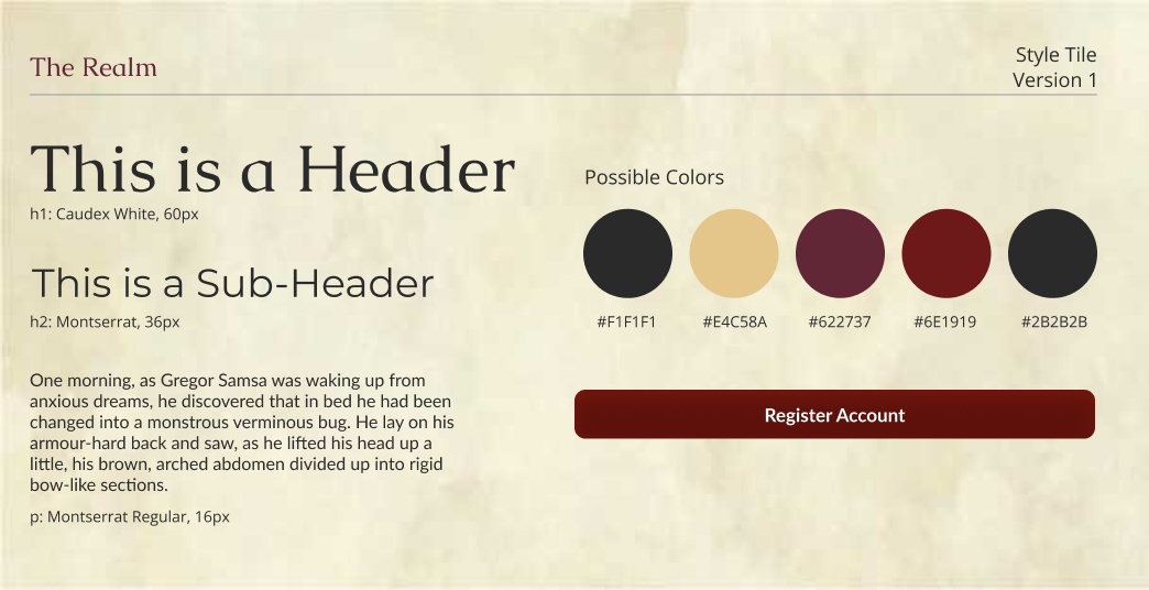
To view the UI Style Tile & Guide in more detail, click here!
Additional Iterations & Testing
Other key design steps included:
Storyboard: We mapped Eric’s journey, a player seeking connection who found support and confidence through The Realm community.
Site Map Creation: Reorganized navigation into clear, community-centered categories.
Low-Fidelity Wireframes: Built grayscale layouts to test navigation and accessibility early.
Usability Testing: Iterations based on Figma/Wix feedback fixed issues like distracting button colors, profile editing visibility, and inconsistent links.
Prototype: Refined into a cohesive high-fidelity prototype that combined clean navigation, inclusive visuals, and reliable interactivity.
Key Visuals & What They Show
Key Visuals & What They Show
I spearheaded the Wix website implementation, focusing on design consistency and user experience. This role meant problem-solving when Figma and Wix didn’t align perfectly and ensuring our platform stayed true to the original vision.
Key refinements included:
Adjusting typography, colors, and button placement for clarity
Expanding pages and functionality to improve engagement
Smoothing out inconsistencies between tools for a unified final design
Presenting the completed product to stakeholders to showcase the difference between design and execution

Bringing Wix and Figma Together
Wix and Figma don’t always play nice. Fonts, spacing, and design details didn’t match 1:1. I worked through those hurdles with iteration and testing, making the platforms work together as seamlessly as possible. With persistence, I delivered a final product that looked great, worked smoothly, and honored the original design intent.

From Insight to Final Delivery

• User input is everything
Our user research showed that even though not everyone is familiar with D&D, there is a clear need for a platform to connect players who share a common interest. High-fidelity prototype testing provided valuable insights from testers, and working with the design team throughout this process was a great experience that strengthened the final design.

• What’s next
If continued, the platform would expand into other game genres, include an internal chat function, develop a group finder feature, and create a mobile version to make the experience accessible across all devices.
• For future designers
My advice for anyone taking this project further is to always center decisions on user feedback and focus on keeping the design cohesive across platforms so the experience feels consistent and seamless.
• Personal growth
This project pushed me to grow as a designer. I learned how to collaborate within a team, adapt designs based on user feedback, and balance time constraints with design goals. More importantly, it showed me that design can’t be done alone. Collaboration and continuous feedback are essential, and those lessons will shape how I approach every future project.