

NSA Redesign

Snapshot
Goal:
Redesign the NSA’s website and mobile platform to improve user experience, modernize visual design, and clearly communicate the agency’s mission and role in national security.
Roles:
UX/UI Design • Wireframing • Prototyping • Usability Testing • Research & Analysis • Design Iteration
Team:
Yarisel • Krissalys • Michael
Tools Used:
Figma • Miro • Trello • Google Forms • Slack
Key Insights:
Navigation clarity: Reorganized site structure for easier access to NSA resources and functions.
Modernized design: Updated visuals and layouts for a professional, consistent look across desktop, tablet, and mobile.
Clear mission messaging: The updated design helped users better grasp the NSA’s national security role, building transparency and trust.
Insights & Impact:
Design with accessibility and user needs front and center to make complex institutions easier to understand.
Reorganize content to reduce friction, support faster access to key information, and simplify navigation across devices.
Use clean visuals, logical structure, and consistent design to strengthen credibility and reinforce trust in the organization.
Explore the Work Behind the Design

The Challenge
The NSA’s website and mobile platforms faced several usability issues that made it difficult for users to engage with the agency’s content. Outdated visuals, inconsistent layouts across devices, and poor navigation limited comprehension of the NSA’s mission and reduced overall user trust. The redesign challenge was to modernize the interface, improve clarity, and make the platform more accessible so users could easily understand the NSA’s role in national security.

Problem
The NSA’s website and mobile platforms were difficult to navigate, with cluttered content and outdated visuals that failed to reflect the agency’s authority. Inconsistent layouts across devices further fragmented the experience and reduced user trust.

Tools Used
To research, organize, and test the redesign, we used:
Figma
Miro
Trello
Google Forms
Slack

Key Insights
Research and analysis highlighted user needs that shaped the redesign:
Clearer navigation paths were necessary to reduce friction and help users find information faster.
A modern, consistent design system was critical to improve comprehension and reinforce trust in the NSA’s credibility.

Design Suggestions
Reorganize content structure to prioritize accessibility and faster information retrieval.
Update visual identity to a modern, professional standard that communicates authority.
Apply consistent design patterns across platforms to build clarity, usability, and trust.
Research Highlights
Before moving into design, we conducted thorough research to understand the NSA’s existing website, its user challenges, and opportunities for improvement. Here’s what we discovered:
Competitive Analysis revealed gaps in navigation, usability, and consistency when compared to both direct competitors (e.g., LookingGlass Cyber Solutions, ReBIT) and indirect competitors (e.g., Hitachi Vantara, CISA). Strengths included modern layouts and stakeholder engagement, but weaknesses showed outdated structures and limited adaptability.
Persona Development focused on a student intern (Alexander Devi), highlighting struggles with navigation, cluttered content, and lack of clear access to opportunities such as the student internship program.
Wireflow & Heuristic Evaluation uncovered issues in page alignment, outdated visuals, and poor navigation flow. These findings emphasized the need for modern, consistent design and streamlined access to key content.
Interview Insights confirmed difficulties with navigation, application processes, and fragmented content organization. Users wanted clearer paths, more transparent information, and a professional design that reflected authority and trust.
Example: Competitive analysis showed that private-sector cybersecurity firms offered modern, user-friendly designs, while the NSA site lagged behind with outdated structures and poor navigation.
Example: User interviews revealed frustration with the student internship page being hard to locate, reinforcing the need for streamlined navigation and consistent layouts.
-
![Proto-Persona: Alexander Devi]()
Proto-Persona: Alexander Devi
As Alexander navigated the NSA website, he struggled to find the student internship page due to poor navigation. He was also disappointed by the website's lack of user-friendliness and frustrated with outdated content and limited transparency in the application process.

Design Build
The design process moved from early research into structured design decisions and testing, with a focus on streamlining navigation, creating a professional visual identity, and ensuring cross-device consistency.
Card Sorting & Site Map
We used open card sorting to understand how users naturally grouped NSA website content. The results informed a revised site map with clear categories such as About, History, Press Room, Careers, and What We Do. This reorganization improved navigation and supported a more intuitive structure for accessing government information.

Visual Identity
To modernize the NSA website, we created a professional visual identity that reinforced the agency’s authority. The color palette incorporated deep blues and golds for trust and credibility, while typography and button design followed material guidelines for clarity across platforms. A style guide was developed to ensure consistency in visual branding and reinforce trust across all touchpoints.

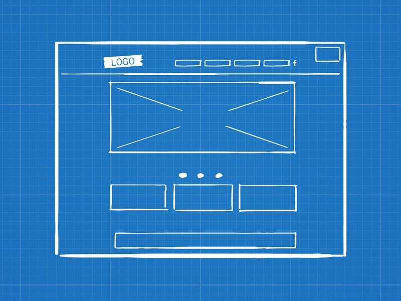
Wireframing & Iterations
We transitioned directly into wireframing to test structure and navigation efficiency. Low-fidelity wireframes validated layout decisions, while clickable prototypes enabled usability testing. Three iterations were completed, incorporating team critiques and user feedback to refine navigation, content organization, and layout.
Usability Testing Feedback
We ran usability tests on the NSA wireframes to evaluate navigation, clarity, and consistency across devices.
Key tasks tested:
Navigate the homepage and locate information
Access the Careers section and internship opportunities
Review content alignment and layout consistency
Major finding:
Navigation was smoother overall, but footer alignment and page consistency needed improvement.
Solution:
We refined the wireframes by aligning the footer, streamlining layouts, and reinforcing consistent design patterns.
✅ Positive feedback:
“It’s super easy to use, and everything flows nicely.”
“I had a pleasant experience exploring the website.”
⚠️ Negative feedback:
“I noticed the footer wasn’t on the homepage when we tested the prototype.”
“Some content sections felt misaligned.”
These insights shaped the final iteration, creating a more consistent and trustworthy NSA platform.
Key Visuals & What They Show
Mobile Design Improvements
The mobile site was redesigned to ensure accessibility and a smoother experience across different screen sizes. User testing revealed navigation and clarity issues, which were addressed with a cleaner, more intuitive layout.
Key improvements included:
Creating a user-friendly interface with simplified navigation
Ensuring seamless access to information across small screens
Applying a consistent style guide for cohesive branding
Updating visuals to reflect professionalism and clarity

To view the Mobile Design (Before) in more detail, click here!
Homepage Redesign
The original homepage struggled with clarity, outdated visuals, and weak hierarchy. Through Figma prototyping and user testing, I redesigned it to feature a stronger structure and improved usability.
Key improvements included:
Strengthening visual hierarchy for clearer content organization
Modernizing the design with updated imagery and branding consistency
Enhancing readability with better typography and layout choices
Addressing user pain points found during testing to improve trust and usability

To view the Homepage Design (Before) in more detail, click here!
From Insight to Final Delivery
• Persistence & Adaptability
Despite challenges with animations and layouts, I achieved the desired look and feel through persistence and flexibility. By adjusting my plans and exploring alternative solutions, I ensured the redesign met both user and project needs.
• Next Steps
If continued, I would focus on expanding the website with new pages, adding interactive elements, and improving responsiveness across all devices. Refining the user interface and strengthening accessibility would be top priorities.
• Revisiting the Final Design
The site could be further improved by enhancing visual consistency, refining navigation for intuitiveness, and ensuring accessibility remains seamless for all users.
• Advice to Future Designers
Always prioritize user feedback, test thoroughly at each stage, and stay adaptable when ideas don’t go as planned. Flexibility and persistence are key to overcoming design roadblocks.
• Growth as a Designer
This project strengthened my skills in responsive design and accessibility, sharpened my problem-solving through adaptability, and reinforced the importance of perseverance. These lessons will guide my future projects toward more user-centered and inclusive outcomes.