



TIMELINE
2025
ROLE
Data Analyst • Researcher
TYPE
Social Impact Data Storytelling
TOOLS
Python • Excel • Jupyter Notebook • Tableau
OVERVIEW
Snapshot
A cross-country analysis examining why fertility rates continue to fall even in countries investing heavily in family support, childcare, and policies meant to make parenthood more manageable.
GOAL
Understand how family support systems, policy investment, and childcare conditions compare with fertility patterns across selected countries, and whether spending totals reflect the support families receive.
TOOLS USED
Python
Pandas
Statsmodels
Seaborn
Excel
Tableau
KEY FINDINGS
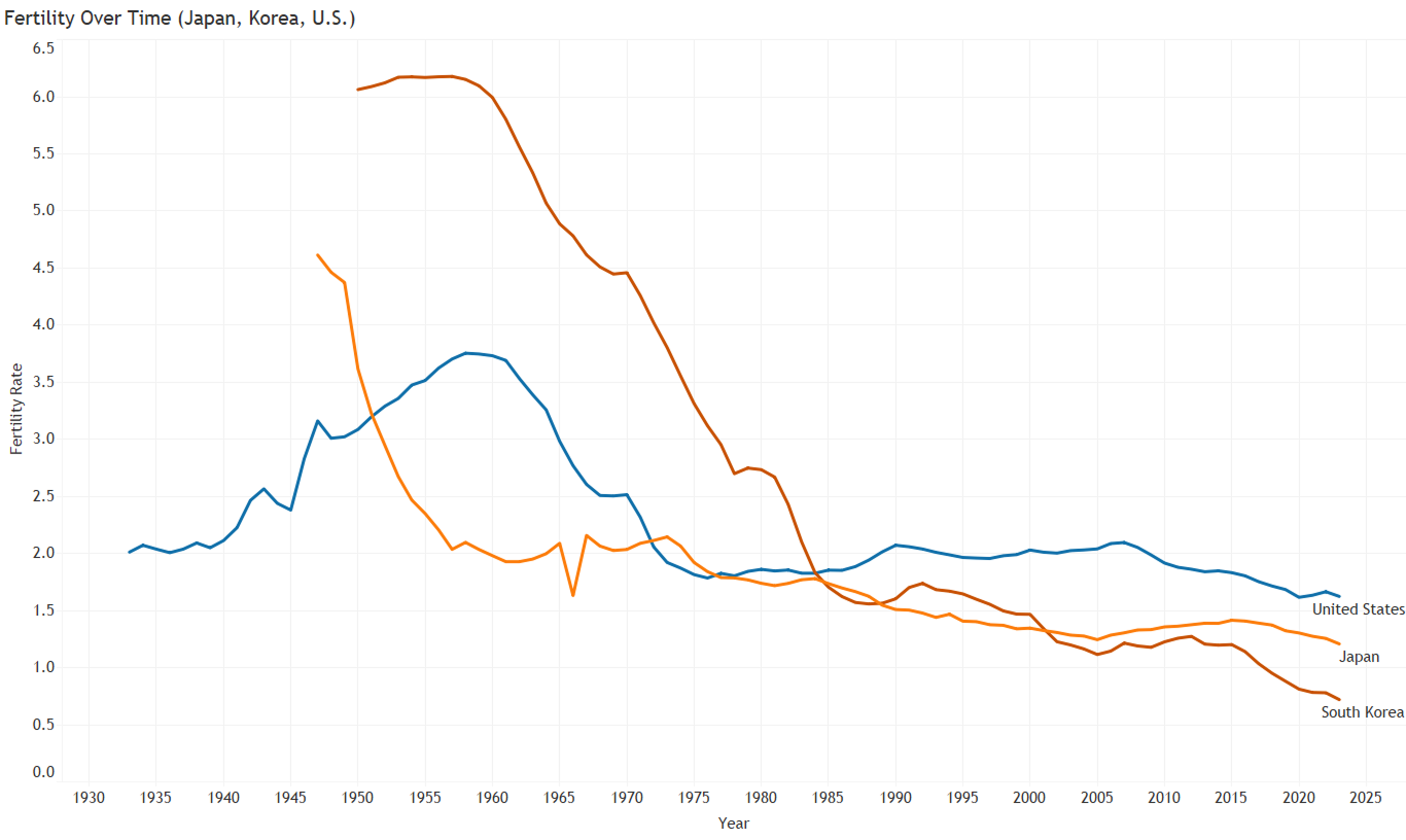
• Fertility rates are still falling in countries like Japan and Korea, even with increased investment.
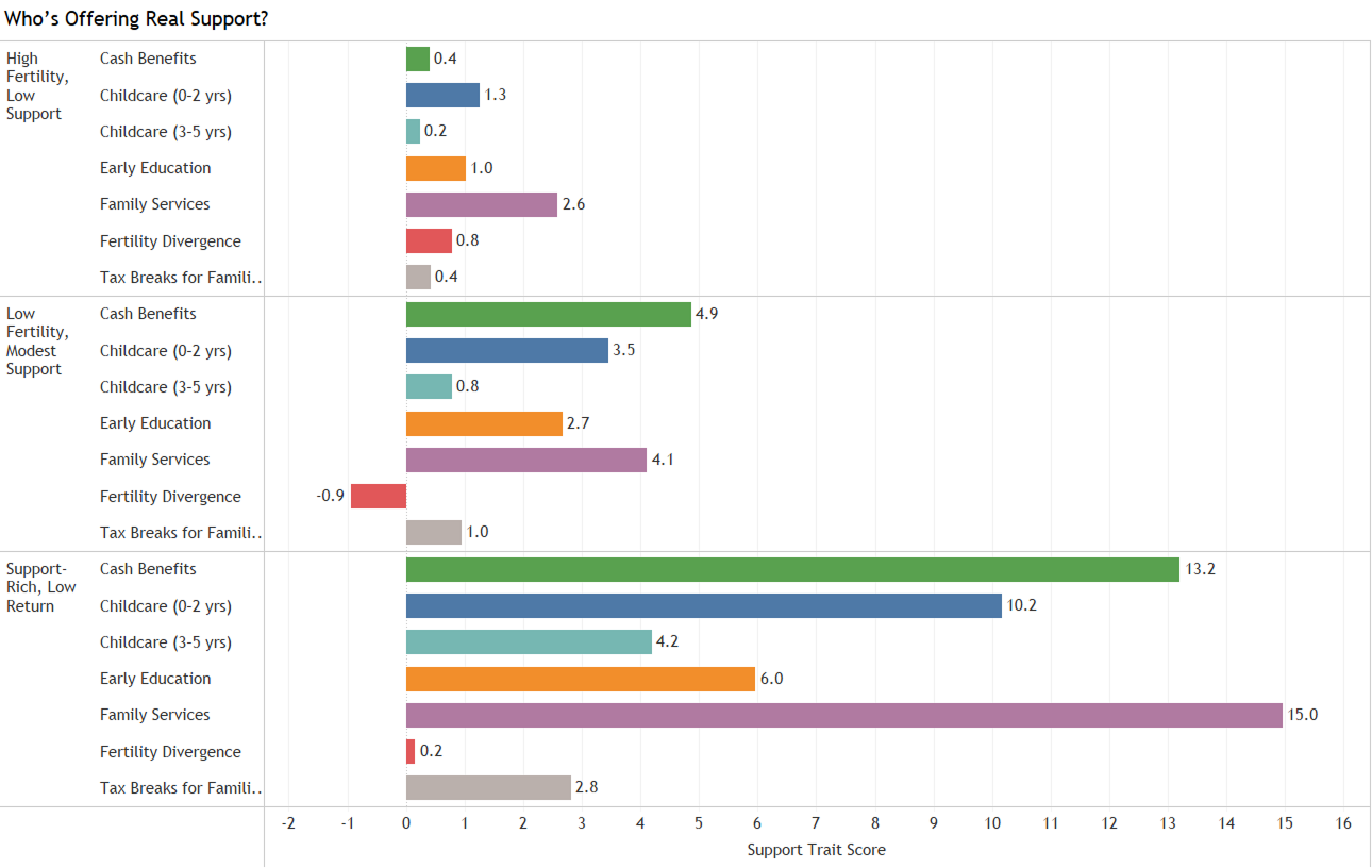
• Total public support showed only a weak relationship with fertility in the countries analyzed.
• Countries followed different support patterns across cash benefits, childcare, education, family services, and tax relief.
OUTPUT & RECOMMENDATIONS
• Built a visual data story using maps, bar charts, and fertility trend lines.
• Broke support into categories like cash, childcare, education, services, and tax relief.
• Reframed the project around the pressures surrounding parenthood rather than treating fertility decline as a question of personal motivation alone.
18
COUNTRIES COMPARED
Fertility, childcare, public support, and policy patterns analyzed
6
SOURCE ORGANIZATIONS
OWID, OECD, World Bank, Global Abortion Policies Database, UNDP, and Georgetown WPS Index
6
SUPPORT INDICATORS
Cash benefits, two childcare measures, early education, family services, and tax relief
THE PROBLEM
The Challenge
Fertility rates are falling across many countries, including places investing heavily in policies meant to encourage people to have children. But the numbers raised a bigger question for me: if governments are spending more, why are fertility rates still dropping?
The challenge was to look past total spending and understand what support looks like. That meant comparing childcare costs, cash benefits, tax relief, family services, and reproductive rights to explore why parenthood can still feel difficult or out of reach, even when support exists on paper.
The core question: Are governments supporting what families need, or are they trying to fix falling birth rates without addressing the pressures behind them?
-
More public spending did not consistently align with higher fertility.
-
Benefits came in different forms, including cash, childcare, education, services, and tax relief.
-
South Korea's public spending data was incomplete, so it had to be flagged and handled carefully.
-
Regression alone did not explain much, so I used clustering and time series analysis to look for patterns the regression missed.
“The data didn’t just show where birth rates were falling. It showed how much support was still missing, even in places trying to raise them.”
— THE QUESTION THAT CHANGED THE DIRECTION OF THE ANALYSIS
INPUT PREPARATION
Cleaning the data before trusting it
I brought together fertility, childcare, public spending, reproductive rights, gender inequality, and women’s safety data from Our World in Data, the OECD, the World Bank, the Global Abortion Policies Database, UNDP, and Georgetown University’s Women, Peace, and Security Index. Each source came in a different format, covered different time periods, and used different country names, so I had to align the data and keep track of where the gaps were.
The key decision: Rather than hiding or guessing around missing data, I flagged it separately and worked only with what I could verify. No point forcing certainty where the data was incomplete.
HOW I WORKED
Analytical Approach
The analysis moved from broad fertility patterns to the support systems around them. I started with fertility trends, then layered in support, childcare, policy, and rights data to explore where the biggest gaps were showing up.
01
Fertility mapping
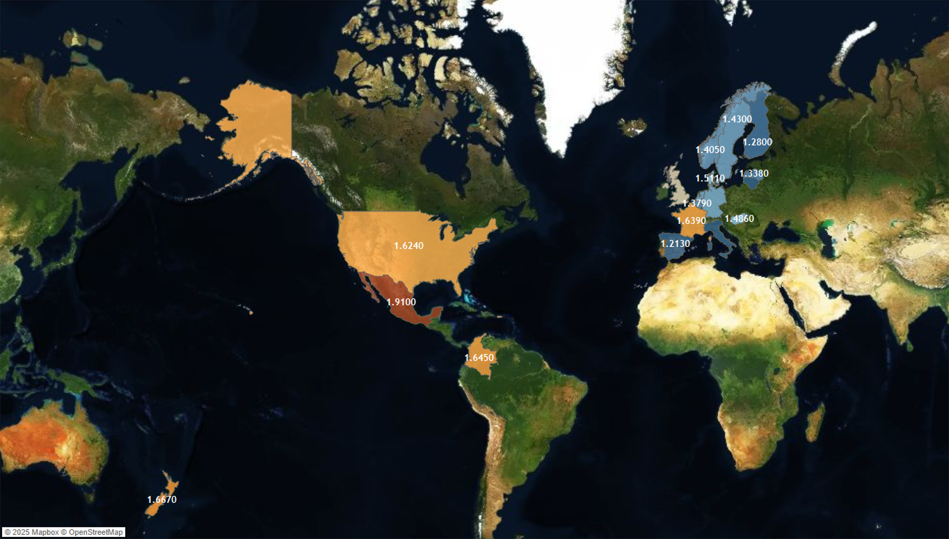
Mapped fertility rates across selected countries to compare where births per woman were lowest and highest.
02
Support structure
Compared childcare, cash benefits, education, services, tax relief, and other support indicators to see how countries supported families.
03
Pattern analysis
Used regression, clustering, and time series analysis to compare spending and fertility patterns.
04
Visual story
Turned the findings into maps, bar charts, and trend lines that made the differences between fertility, support, cost, and policy easier to see.
See the full story in Tableau
See how the analysis moves from fertility trends to support patterns in the interactive
Tableau story.
INTERACTIVE DASHBOARD
WHAT THE DATA REVEALED
Four patterns that changed the logic
The data didn't just confirm assumptions. It complicated them. The most important findings were the ones that challenged the simplest explanations for falling birth rates.
Click for a closer look
KEY FINDING 01
More spending did not guarantee higher fertility
Countries with higher public support still showed low fertility in some cases. The regression found only a weak relationship between total support and fertility, showing that spending alone did not explain the differences.
Click for a closer look
KEY FINDING 02
Japan and Korea kept declining as support increased
Both countries experienced long term fertility decline during years when public family support increased. Even with higher investment, fertility remained near historically low levels.
Click for a closer look
KEY FINDING 03
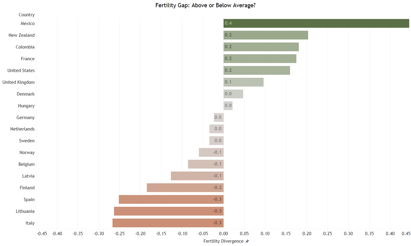
Fertility levels varied across the countries
Fertility divergence showed how far each country sat above or below the average of the 18 countries analyzed. Mexico ranked furthest above the group average, while Italy and Lithuania ranked furthest below it.
Click for a closer look
Low fertility was not explained by one factor alone
Countries with higher support still showed low fertility, while some countries with less measured support ranked higher. The pattern showed that spending alone was not enough to explain the differences, leaving questions about affordability, access, policy design, and factors the data did not capture.
KEY FINDING 04
The pattern that kept appearing: The numbers kept raising the same question. If spending was increasing but fertility remained low, what was still missing from the support families were being offered?
WHAT I LEARNED
Main Insights
01
More support does not automatically mean higher fertility
I learned not to treat spending totals as a shortcut for understanding whether support was working.
02
Missing data had to be handled carefully
South Korea's public spending data had gaps, so I flagged what was incomplete, cross-checked what I could, and avoided forcing conclusions where the data was not strong enough.
03
Fertility decline is bigger than one policy or one number
Childcare, cash benefits, services, and reproductive rights were all part of the wider picture. The analysis showed that no single measure explained the differences on its own.
04
Spending totals left important questions unanswered
The unanswered questions became part of the finding. The data showed me where the analysis stopped, especially around timing, access, and the costs families still carried.
DECISION LOGIC
From Insight to Decision
The findings pointed back to the same bigger question: what kind of support makes parenthood feel possible, and where are systems still falling short?
01
Finding
More spending did not guarantee higher fertility
Implication
That shifted the focus from how much governments spent to what policy should consider beyond the total.
02
Finding
Childcare costs varied widely across countries
Implication
Even in countries with strong support systems, high out-of-pocket childcare costs can place a heavy burden on families. What matters is not only what governments spend, but what families are still expected to pay.
03
Finding
Financial support did not capture the full picture
Implication
Financial support alone does not tell the full story. Reproductive rights, legal protections, safety, and autonomy also belong in the conversation when looking at decisions around parenthood.
What this changed in my approach: This project pushed me to hold two things at once: analytical rigor and human sensitivity. The data is about real people navigating real pressure with real consequences. That context has to shape every decision, from how the data is cleaned to how the final story is told.
EXPLORE THE WORK
See the Full Analysis
View in Tableau
Explore the full Tableau dashboard with fertility trends, support comparisons, maps, and cross-country patterns that bring the story together.

View the code on GitHub
Review the full project on GitHub, including data cleaning, regression, clustering, time series analysis, and supporting project files.
