


TIMELINE
2023
ROLE
UX/UI Designer
TYPE
Mobile App Concept
TOOLS
Figma • Miro • Trello
TEAM
Yarisel • Sana • Valeria • Sean • Beth
OVERVIEW
Snapshot
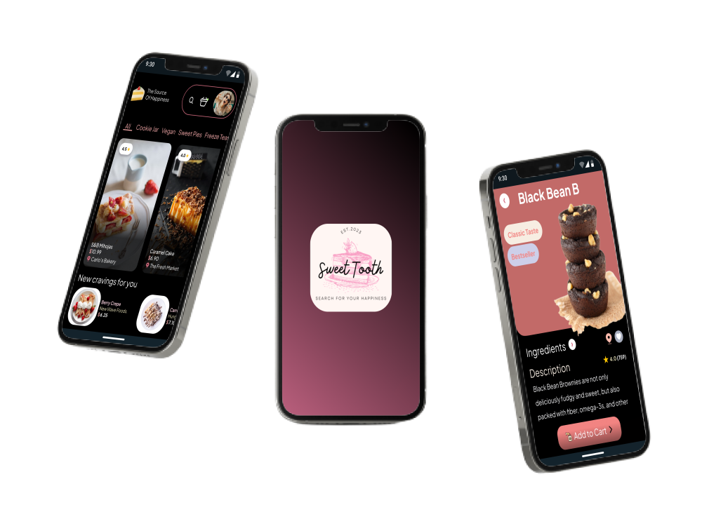
A mobile app concept that brings dessert discovery and ordering into one place, helping users find what they are craving across restaurants, bakeries, and other businesses.
GOAL
Design a mobile experience that helps users find and order desserts from different restaurants, bakeries, and businesses, while making dietary needs easier to consider during the search.
DESIGN STACK
Figma
Miro
Trello
Google Forms
Google Slide
DESIGN RESPONSE
• Included dietary focused options, including a dedicated Vegan section.
• Replaced the early “Order Again” idea with a “Craving for You” recommendation concept.
• Built dessert selection, cart, checkout, and confirmation into the mobile flow.
• Added back and cancel controls, simplified the home page, and revised search after usability testing.
RESEARCH FINDINGS
• Health concerns around sugar, calories, and dietary restrictions came up across the research, but they were not the same for every participant.
• Desserts were often connected to enjoyment, memories, celebrations, and sharing with others.
• Dessert habits varied, from frequent treats to people who only ate desserts occasionally.
• Convenience mattered, with some participants choosing store bought or restaurant desserts when they did not want to make something themselves.
5
TEAM MEMBERS
Yarisel, Valeria, Sana, Sean, and Beth collaborated on the concept, research, and design work.
5
USER INTERVIEWS
Five participants shared their dessert habits, preferences, health concerns, and behaviors, which were later organized into the research synthesis.
3
TASKS TESTED
Users tested search, the Vegan dessert flow, and the Craving-to-checkout path in the low-fidelity prototype.
THE PROBLEM
The Challenge
Finding desserts that meet dietary needs can feel frustrating and time consuming. For people managing blood sugar or following specific dietary preferences, finding the right dessert can mean searching through different bakeries, restaurants, and businesses to see what works for them.
The concept behind Sweet Tooth focused on making that process easier. Instead of searching one business at a time, users could look for the dessert they wanted, explore options that fit their needs, and order it through the same app.
The core problem: finding desserts that fit a user’s dietary needs could mean searching through multiple bakeries and restaurants just to find an option that worked for them.
-
Research and ideation showed that dietary restrictions mattered for some users, leading the team to prioritize dietary filters alongside search.
-
Users needed an easier way to find desserts they could eat without checking multiple bakeries, restaurants, and menus one by one.
-
Once users found a dessert, the experience still needed a way for them to complete the purchase without leaving the app.
-
“Order Again” was one of the ideas prioritized early, alongside search and dietary restrictions, giving users a way to return to familiar dessert choices more easily.
“Desserts were still about enjoyment and sharing, but health concerns shaped what people felt comfortable choosing.”
— RESEARCH TAKEAWAY
RESEARCH PREPARATION
Defining the problem from player needs
The research phase combined competitor analysis, user interviews, survey feedback, and persona work to understand how people discover desserts, what gets in the way, and where dietary needs fit into that experience.
Competitive analysis
Reviewed direct and indirect competitors to see how they handled dessert discovery, variety, reviews, and browsing. The comparison showed gaps such as cake only offerings and broader platforms without a dedicated dessert focus.
Survey feedback
Captured dessert preferences, health concerns, sharing habits, frequency, and how dietary restrictions affected different users.
User interviews
Revealed strong emotional ties to desserts, different health concerns, and how often desserts were connected to family, sharing, and celebrations.
Proto persona
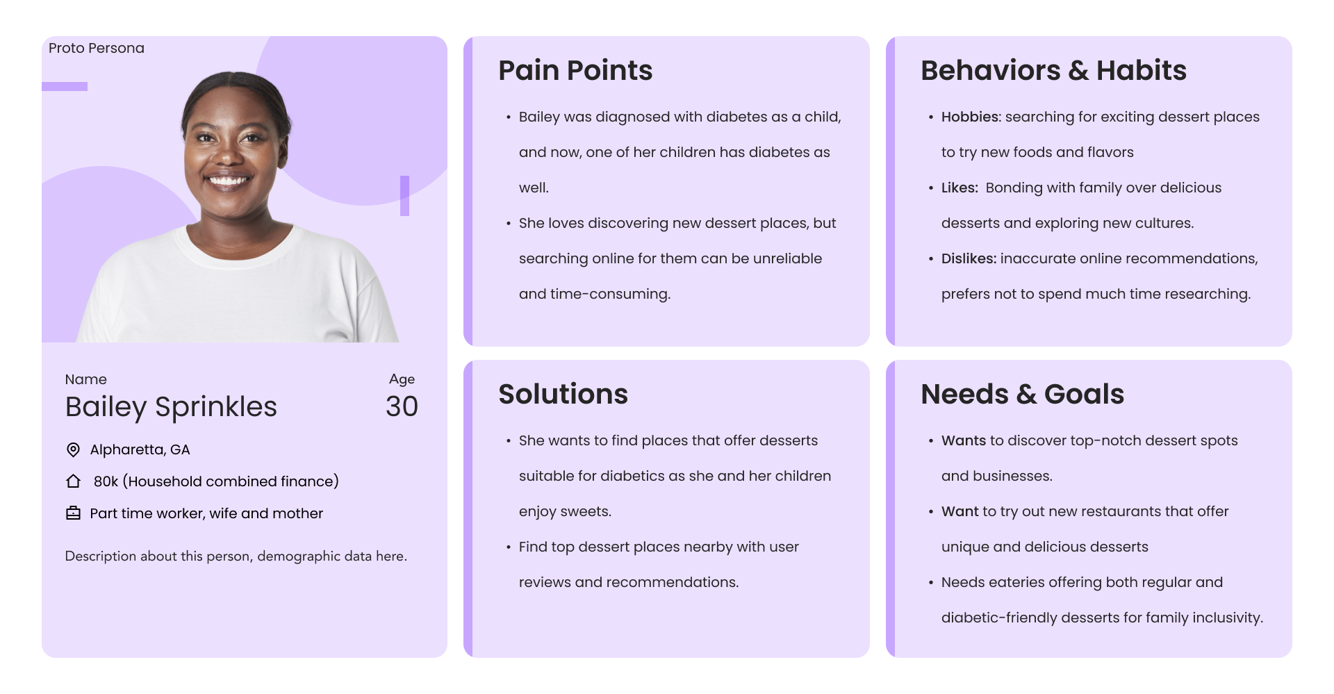
Bailey helped frame the experience around someone who loves discovering desserts but also needs to balance diabetes in the family, different preferences, and the time it takes to find good options nearby.
Main pattern: desserts were tied to enjoyment, family, sharing, and celebrations, but health concerns and the effort of finding the right option could complicate the experience. Sweet Tooth brought those needs together without losing the fun of discovering dessert.
HOW I WORKED
Design Approach
The process moved from research and ideation into sketches, user flows, wireframes, and usability testing, with each step helping shape how Sweet Tooth handled discovery, ordering, and checkout.
01
Define the need
Focused the concept on making dessert discovery easier across different businesses while still leaving room for health and dietary needs.
02
Sketch and simplify
Compared the team’s different sketch ideas, selected the strongest parts, and used them to build the user flow and low-fidelity prototype.
03
Map the order flow
Mapped how users could search, choose a dessert, review their options, add it to the cart, and move through checkout.
04
Test and refine
Used guerrilla testing on the low-fidelity prototype to identify problems with search, navigation, and checkout before the next iteration.
Search and dietary needs became early priorities.
The priority matrix placed search and Order Again in “Do It Now,”
with dietary restrictions identified as an important next feature.
DESIGN PRIORITY
WHAT THE RESEARCH REVEALED
Four artifacts that shaped the design
The research moved from understanding dessert habits, health concerns, and family needs into showing how those ideas could work across discovery, selection, and ordering.
Click for a closer look
RESEARCH ARTIFACT 01
The proto persona centered family, health, and convenience
Bailey Sprinkles represented someone who loved desserts but also needed to think about diabetes, family preferences, and finding places that offered both diabetic-friendly and regular options.
Click for a closer look
RESEARCH ARTIFACT 02
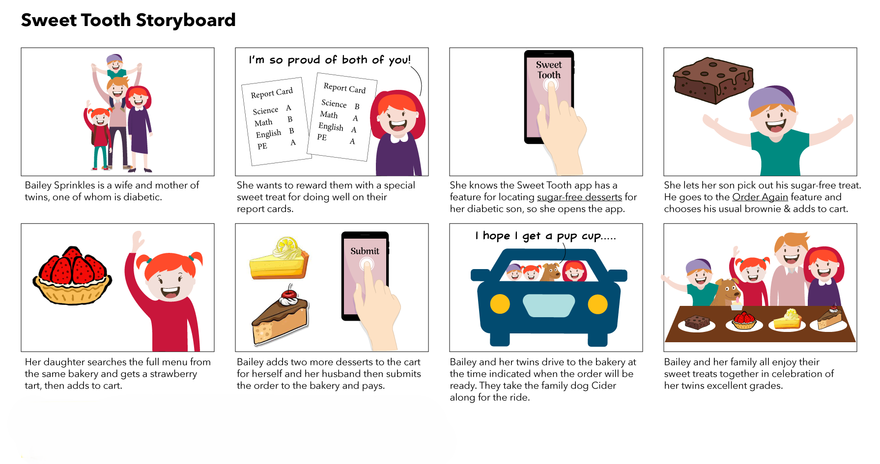
The storyboard clarified the real-world scenario
The storyboard showed Bailey using Sweet Tooth to find a sugar free dessert for her son, add other treats for the family, place the order, and pick everything up from the bakery.

Click for a closer look
RESEARCH ARTIFACT 03
The user flow connected search to payment
The user flow mapped the different ways someone could move from the home screen into search or browsing, choose a dessert, add it to the cart, and continue through payment.
Click for a closer look
RESEARCH ARTIFACT 04
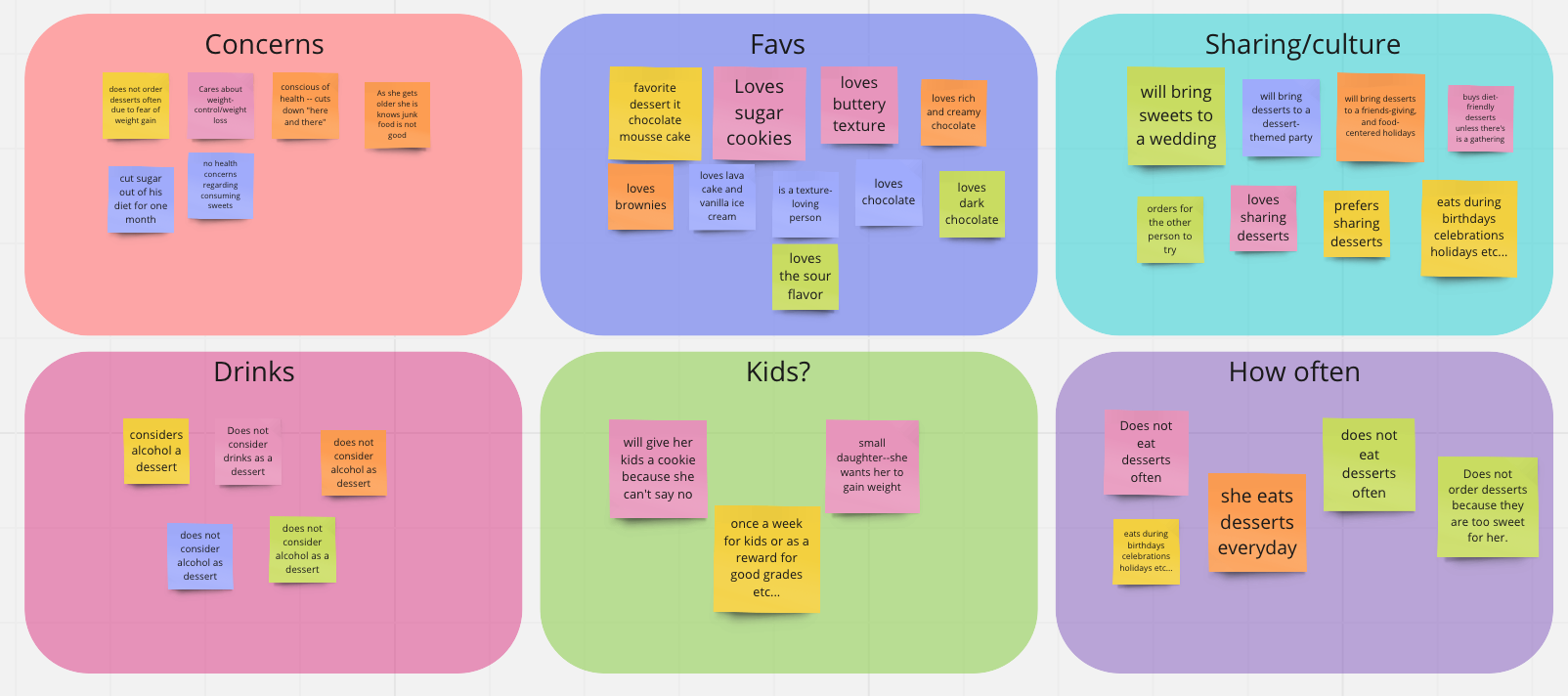
The affinity diagram pulled the interviews into patterns
The five interviews were grouped around recurring themes like health concerns, favorite desserts, sharing, family, and how often people ate sweets. Seeing those patterns together helped the team understand where enjoyment, everyday habits, and dietary concerns crossed over.
The structural pattern: Sweet Tooth brought dessert discovery, health considerations, and ordering into the same experience. Search and dietary restrictions became early priorities, while the prototype connected those ideas to browsing, cart, and checkout.
MAIN INSIGHTS
What the research supported
01
Dietary needs became part of discovery
Dietary restrictions became one of the team’s top three ideas alongside search and “Order Again,” showing that health needs belonged within the discovery experience.
02
Familiar choices matter
“Order Again” was prioritized early as a quick way back to familiar choices. In the final prototype, the team replaced it with “Craving for You,” which suggested desserts based on previous searches.
03
Ordering needed a complete path
The original concept let users find desserts, but the next design problem was giving them a way to purchase what they found and move through checkout to completion.
04
Simple interactions worked best
Testing showed that users found much of the prototype simple and straightforward, while search, navigation, and the place order interaction exposed areas that still needed work.
FROM INSIGHT TO DECISION
The guerrilla usability tests gave the team concrete interaction issues to fix and also confirmed which parts of the experience already felt strong.
How testing guided the next iteration
01
Finding
Users were confused by the search bar
Design Response
Reworked the search bar after testers were unsure where to click and whether they were supposed to type or select something.
02
Finding
Extra navigation created friction
Design Response
Added back and cancel controls, simplified the home page, and removed the speed checkout idea after testing showed that the flow needed clearer navigation.
03
Finding
Some interface details felt inconsistent
Design Response
Addressed inconsistent fonts and spacing, along with navigation issues such as the tab extending off screen and being unable to exit search without closing the app.
04
Finding
Users responded well to the vegan page and simple flow
Design Response
Kept the Vegan section that testers found easy to use, while the final prototype also added ingredient information to make dessert details more transparent.
What this means: testing showed what was already working and where the experience still needed attention. Those findings gave the team a clearer direction for the next version of Sweet Tooth.
EXPLORE THE WORK
See the final prototype
Mobile prototype
Explore the Sweet Tooth mobile flow from dessert discovery through cart, checkout, and confirmation, including the dietary options built into the experience.

Case Study Presentation
See the original team presentation covering the research, ideation, user flow, testing, and final prototype.

User testing
Review the guerrilla usability testing that uncovered issues with search, navigation, spacing, and checkout.
