



TIMELINE
2024
ROLE
Data Analyst
TYPE
Public Health Analysis
TOOLS
Excel • Tableau • SQL
OVERVIEW
Snapshot
A public health data analysis exploring influenza mortality, age-related vulnerability, historical trends, and state-level differences across the United States.
GOAL
Identify where influenza deaths were most concentrated, how mortality patterns changed by age and location, and where historical trends could help guide seasonal resource planning.
TOOLS USED
Excel
Tableau
SQL
pgAdmin 4
KEY FINDINGS
• Recorded influenza deaths varied across states and age groups
• Older age groups were much more heavily represented in the influenza mortality data than younger populations
• Recorded influenza deaths changed across the study period, with 2013 reaching the highest point in the analyzed series
• State-level differences showed why population size, age, and geography needed to be considered together
OUTPUT & RECOMMENDATIONS
• Compared influenza deaths, population, and geographic patterns across states
• Identified older adults as the age groups most affected in the mortality data
• Built interactive Tableau visuals and forecasts to make patterns easier to understand
• Developed recommendations for seasonal planning, staffing, and resource allocation
2009-2017
STUDY PERIOD
Multi-year influenza patterns reviewed across the United States
50
STATES COMPARED
State-level mortality, population, and geographic patterns
3
ANALYSIS LENSES
Location, age, and time used to compare influenza patterns
THE PROBLEM
The Challenge
Influenza affects every state, but national totals do not show which locations and age groups are more affected than others.
Bringing state, age, mortality, and population data together made it possible to see patterns that national totals left hidden.
The challenge was not just comparing numbers. It was accounting for population size, keeping age-related vulnerability visible, and turning datasets into findings that could support more focused public health planning.
The core question: Where were influenza deaths concentrated across states and age groups, and how could those patterns help guide seasonal staffing and resource planning?
-
With different structures, labels, and levels of completeness
-
Made raw counts misleading without additional context
-
Needed to remain visible inside broader geographic patterns
-
Needed to connect back to practical public health decisions
“A national average can describe the country and still miss the communities most affected.”
— THE IDEA THAT GUIDED THE ANALYSIS
INPUT PREPARATION
Cleaning the data before comparing patterns
The analysis combined mortality, population, geographic, and demographic data from multiple sources. Each dataset needed to be cleaned and aligned before I could compare states fairly.
I standardized state names, abbreviations, and geographic labels, checked for missing values and duplicates, and reviewed the data for consistency before merging everything together. I also checked the time fields so the comparisons stayed within the intended study period.
Then I created clean tables for maps, trend lines, age comparisons, forecasting, and Tableau dashboards. This made it easier to compare patterns across states and age groups without letting messy or mismatched data distort the results.
Key decision: The data needed context from more than one angle. Mortality, population, age, location, and time each added a different part of the picture.
HOW I WORKED
Analytical Approach
I moved from broad national trends to state and age-level differences, then connected those patterns to forecasting and public health planning.
01
Trend analysis
Reviewed influenza death patterns from 2009 to 2017 to see how recorded deaths changed over time and where major peaks appeared.
02
State comparison
Compared influenza deaths, population, and geographic patterns across states to identify where death totals were highest and where population context changed the interpretation.
03
Age analysis
Examined mortality by age group to understand which populations were most affected.
04
Forecasting and planning
Used historical trends and forecasting to explore future influenza patterns and support staffing and resource planning.
See the full project on GitHub
Explore the cleaned datasets, SQL work, Tableau workbook, case study,
slides, and project documentation.
PROJECT REPOSITORY
WHAT THE DATA REVEALED
Four patterns that reframed the strategy
The strongest findings came from comparing state, age, and historical patterns instead of relying on national totals alone.
Click for a closer look
KEY FINDING 01
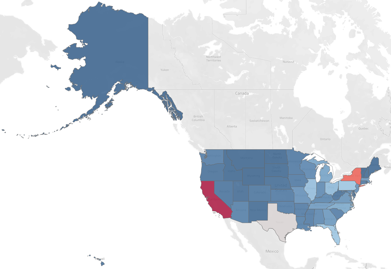
Influenza deaths varied widely across states
California and Texas stood out with some of the highest recorded death totals, showing why national numbers alone were not enough to understand state-level differences.

Click for a closer look
KEY FINDING 02
2013 stood out as the highest point in the series
The 2013 peak showed why historical patterns matter when planning staffing and resources for future flu seasons.
Click for a closer look
KEY FINDING 03
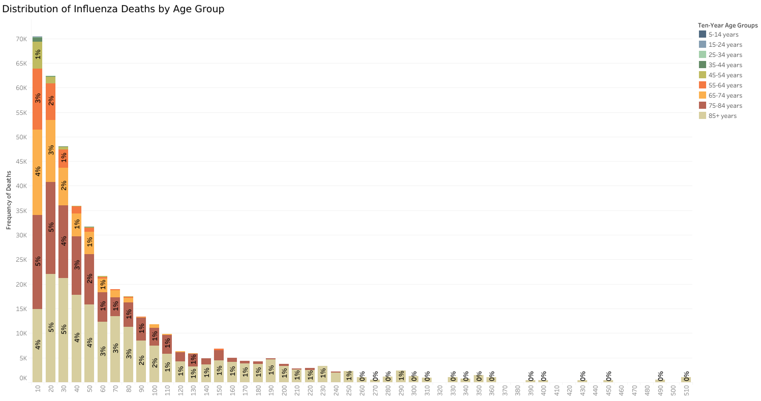
Age was one of the clearest vulnerability signals
Older adults were much more heavily represented in the mortality data, with the 85+ group standing out the most. This made age an important factor in public health and resource planning.
Click for a closer look
KEY FINDING 04
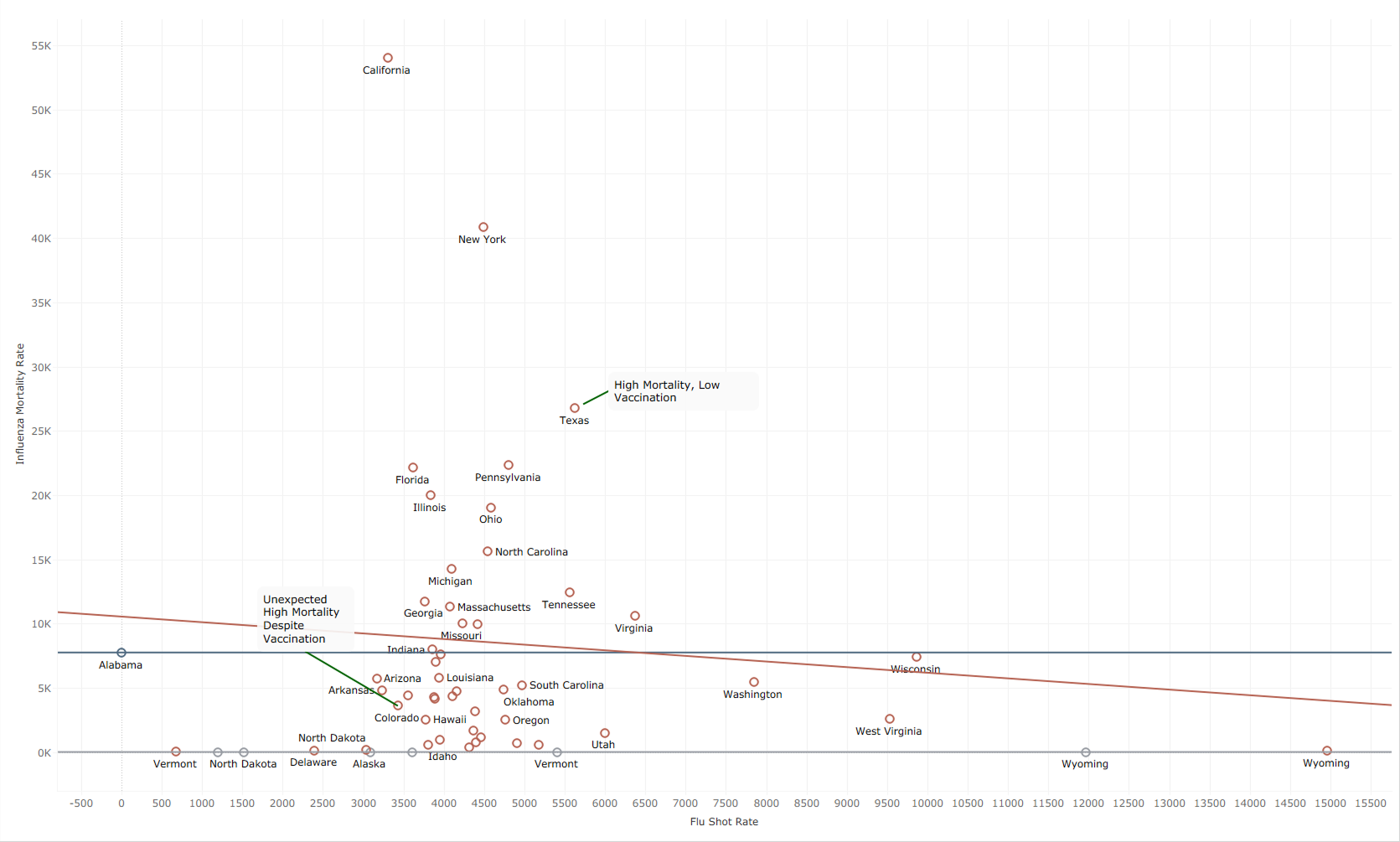
Population size changed how state totals needed to be read
Large state totals did not automatically mean a state was more affected relative to its population. Population context was necessary to keep comparisons from overstating differences driven mainly by state size.
The finding that reframed the brief: No single measure explained the full picture. Differences across location, age, population, and time showed where more focused outreach, staffing, and resource planning could make the biggest difference.
WHAT I LEARNED
Main Insights
01
Location changes the story
Looking beyond national totals made the state-level differences much easier to see and showed why location matters when setting priorities.
02
No single measure told the whole story
The clearest picture came from combining mortality with age, population, and location instead of expecting one variable to explain everything.
03
Timing matters for planning
Historical patterns became more useful when they were connected to what teams could prepare for earlier, including outreach, staffing, and resources.
DECISION LOGIC
From Insight to Decision
The value of the analysis came from connecting the patterns to practical decisions around outreach, staffing, and resource planning.
01
Finding
Recorded influenza deaths varied widely across states, but raw totals did not tell the whole story.
Recommendation
Use population and geographic context when comparing states instead of relying on national totals alone.
02
Finding
Older adults were the most affected in the mortality data.
Recommendation
Focus prevention, communication, and resource planning more heavily on older populations, especially adults aged 85 and older.
03
Finding
2013 marked the highest recorded point in the historical series.
Recommendation
Use historical patterns and forecasts to support earlier staffing, outreach, and resource planning.
04
Finding
State totals looked different once age and population context were considered.
Recommendation
Avoid treating high totals as a complete explanation and look at who was most affected before setting priorities.
What I learned: The hardest part was not finding the highest number. It was deciding which patterns actually mattered, where more context was needed, and how to turn those findings into public health priorities people could use.
EXPLORE THE WORK
See the Full Analysis
Note: This Tableau story reflects the original project analysis. The case study above highlights the findings that held up best after a later review of the data and methodology.
View in Tableau
Explore the mortality trends, state comparisons, vaccination-related visuals, and forecasting work through the interactive Tableau story.

View the project on GitHub
Review the cleaned datasets, SQL work, Tableau files, and supporting project documentation.
