


TIMELINE
2023
ROLE
UX/UI Designer
TYPE
Website + Mobile Redesign
TEAM
Yarisel • Krissalys • Michael
TOOLS
Figma • FigJam
OVERVIEW
Snapshot
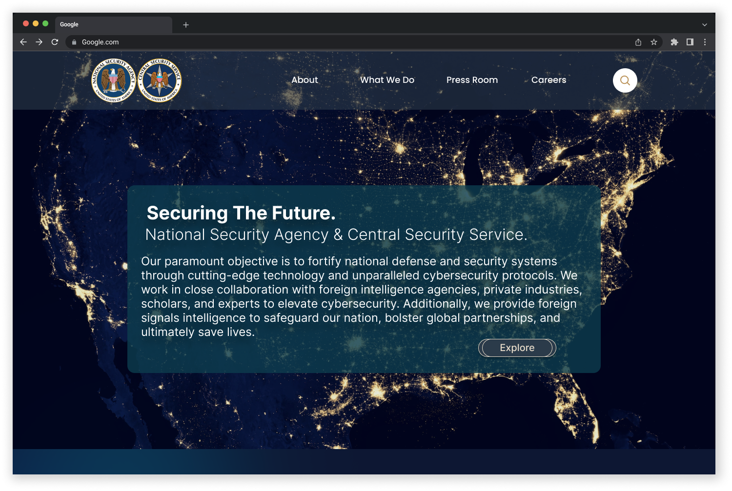
A team redesign of the NSA website and mobile experience focused on a specific usability problem: users could reach the Careers area, but finding and moving through the Student Internship application path created unnecessary friction.
GOAL
Redesign the NSA website and mobile experience to make navigation clearer, organize information more logically, and create a more consistent experience across screen sizes.
DESIGN STACK
Figma
Miro
Trello
Google Forms
Slack
DESIGN RESPONSE
• Reworked navigation and site structure
• Removed or merged duplicate navigation terms
• Created desktop and mobile navigation systems
• Iterated prototypes using usability feedback
RESEARCH FINDINGS
• The Careers page was straightforward to reach
• The deeper application path created friction
• Student Internship needed greater visibility
• Navigation organization caused confusion
3
CORE USABILITY TASKS
Careers access, the application path, and Student Internship navigation were evaluated.
Web + Mobile
RESPONSIVE SCOPE
The project included desktop and mobile navigation and homepage redesign work.
3 Iterations
DESIGN REFINEMENT
Wireframes and prototypes were refined through critique and usability feedback.
THE PROBLEM
The Challenge
The research did not show that every part of the NSA site was difficult to use. In fact, participants said getting to the Careers page was straightforward.
The friction appeared deeper in the journey. Users had trouble identifying the Student Internship option, moved through too many pages to reach the application area, and encountered multiple routes that could lead to the same destination.
The core problem: the site contained the information users needed, but the structure made the path longer and less predictable than it needed to be.
-
The application journey required users to move through several pages before reaching the destination.
-
The option needed to be more visible within the Careers experience.
-
During card sorting, we identified duplicate keywords and unnecessary navigation terms.
-
Evaluation across Apple and Android devices showed that the desktop experience did not translate cleanly to mobile.
“Getting to Careers was not the problem. The friction started when users had to figure out where to go next.”
— THE INSIGHT THAT GUIDED THE REDESIGN
RESEARCH PREPARATION
Building the problem from evidence
Before redesigning the interface, the team reviewed how the existing site worked, traced the Student Internship path, compared navigation patterns, and synthesized recurring issues into design priorities.
Heuristic evaluation
Reviewed the homepage, navigation, page alignment, and mobile experience for usability issues.
Guerrilla usability testing
Asked users to navigate to Careers, locate Student Internship opportunities, and reach the application area with little guidance.
Affinity synthesis
Grouped recurring concerns around confusing navigation, too many pages, unclear buttons, missing home access, and content organization.
Competitive review
Compared the NSA experience with other cybersecurity and government-facing sites to study navigation and interface patterns.
Important research distinction: The Careers page itself was not the main friction point. The research showed that the deeper Student Internship and application path was where the experience became harder to follow.
HOW I WORKED
Design Approach
The redesign moved from observing the existing flow to reorganizing the system underneath it. Navigation and information architecture were addressed before visual styling was finalized.
01
Trace the current journey
Followed the Student Internship path from the NSA homepage through the application flow.
02
Organize the findings
Used the affinity diagram, empathy map, and priority matrix to organize recurring usability concerns.
03
Rebuild the structure
Used open card sorting and sitemap revisions to remove duplicate terms and simplify navigation categories.
04
Prototype and test
Built desktop and mobile wireframes, then refined them using usability feedback and iteration.
Rebuilding the navigation
Card sorting and sitemap revisions helped simplify categories, remove duplicate terms,
and clarify the site structure.
INFORMATION ARCHITECTURE
WHAT THE RESEARCH REVEALED
Four artifacts that shaped the redesign
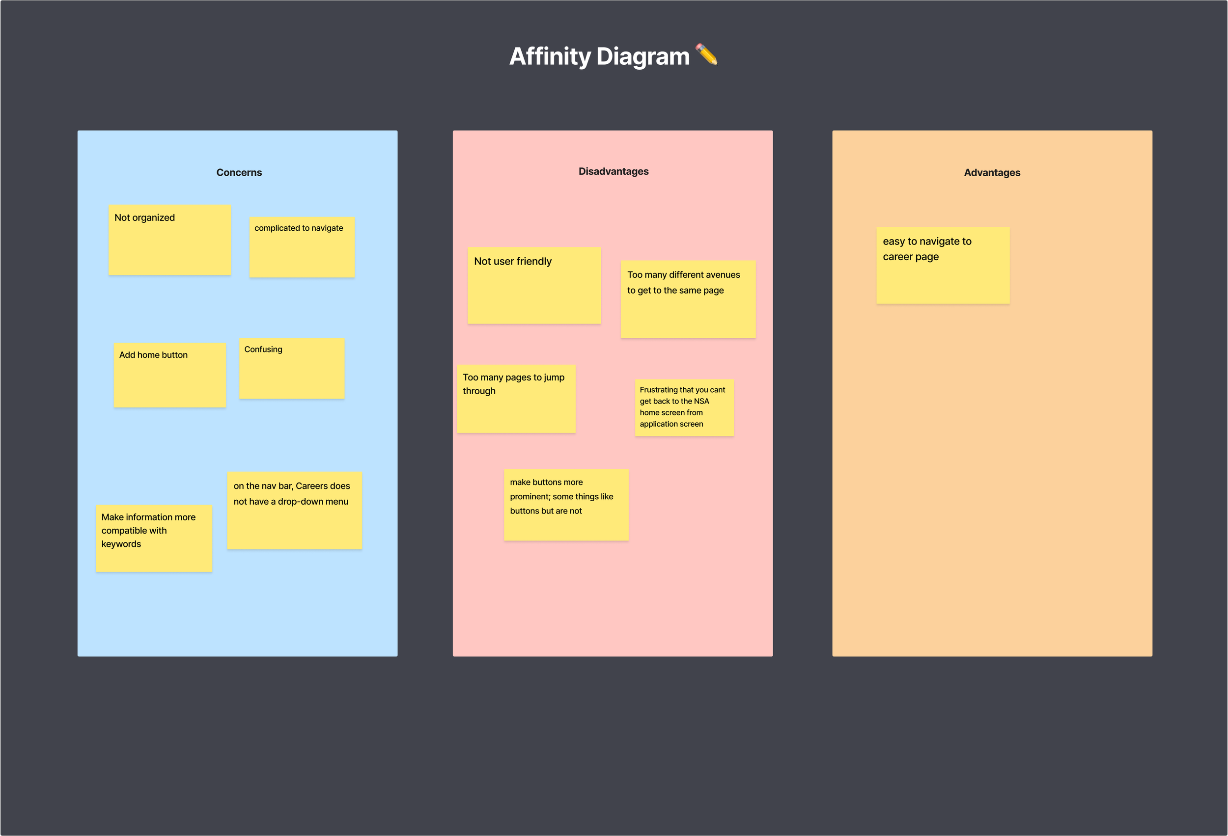
Together, these artifacts narrowed a broad “not user friendly” concern into specific navigation problems the team could address.
Click for a closer look
KEY FINDING 01
Navigation friction kept repeating
Users described the site as confusing, not organized, and complicated to navigate. Recurring requests included a home button, clearer buttons, fewer pages, a Careers drop-down, and more organized information.
KEY FINDING 02
Click for a closer look
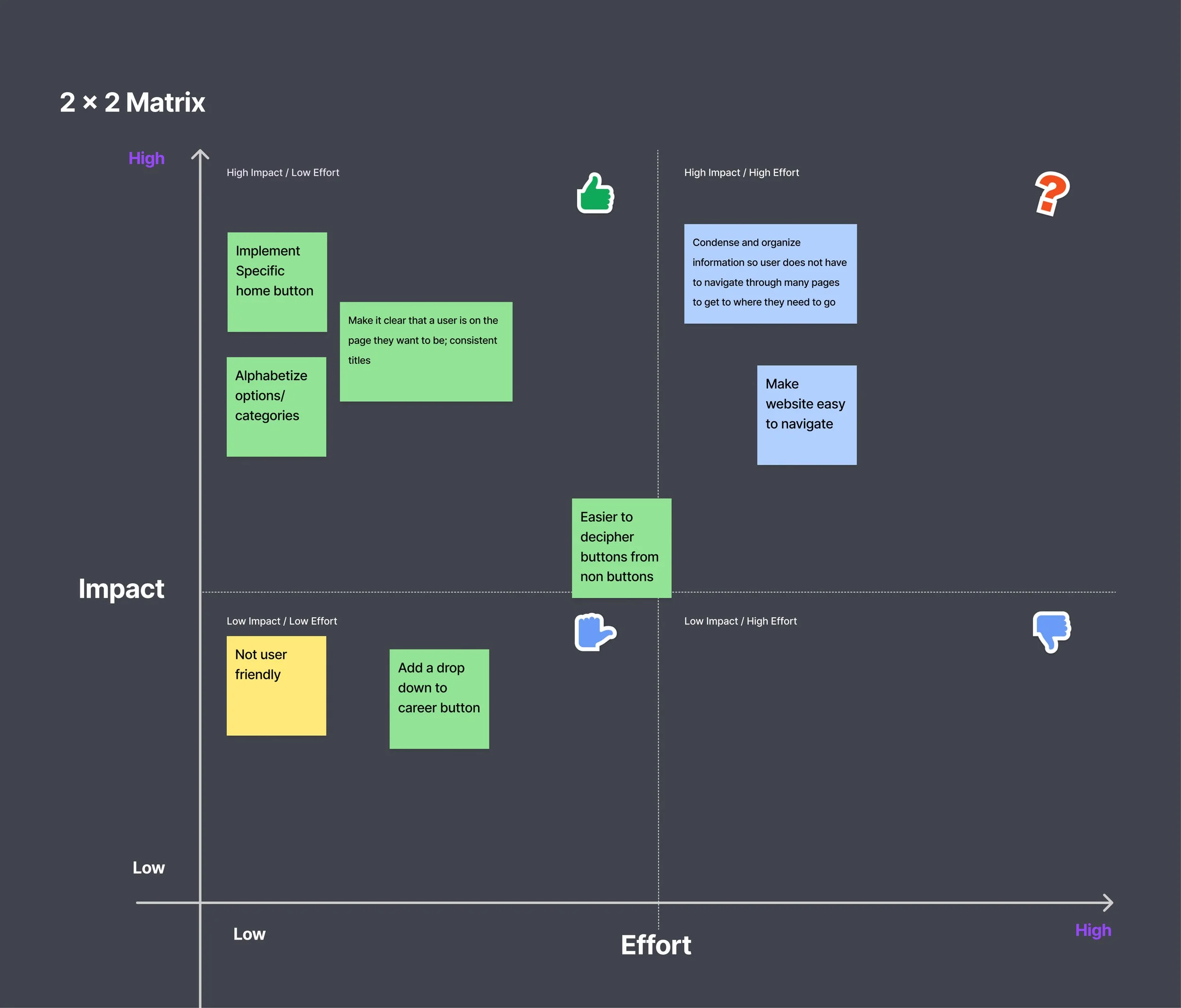
The 2×2 matrix turned concerns into priorities
High-impact, lower-effort priorities included adding a dedicated home button, alphabetizing options, and making page titles more consistent. Larger structural work centered on organizing information and simplifying navigation.
Click for a closer look
KEY FINDING 03
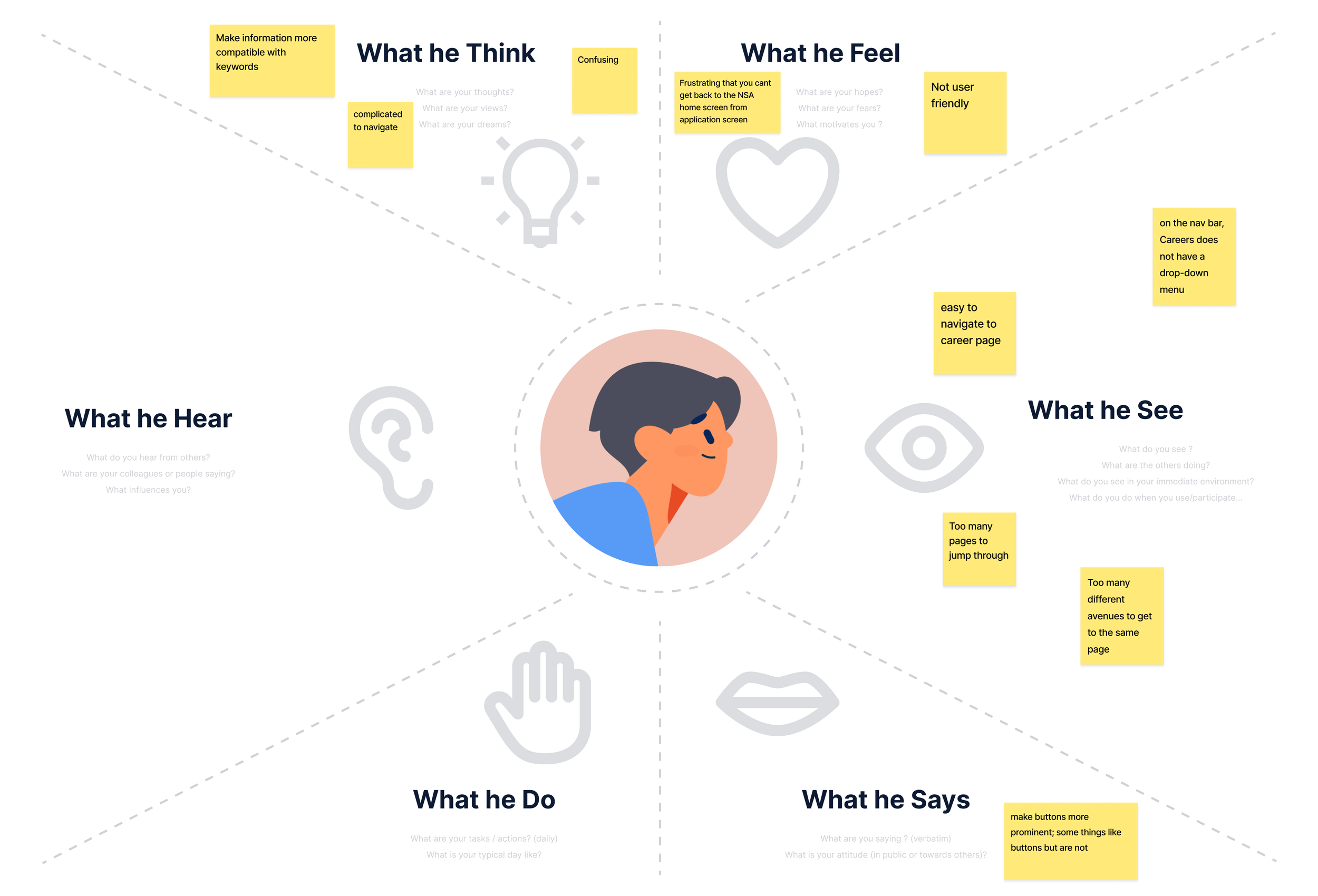
Empathy map surfaced key frustrations
The map captured confusion around navigation, difficulty returning to the NSA home experience from the application path, too many pages, unclear button treatments, and the missing Careers drop-down.
Click for a closer look
KEY FINDING 04
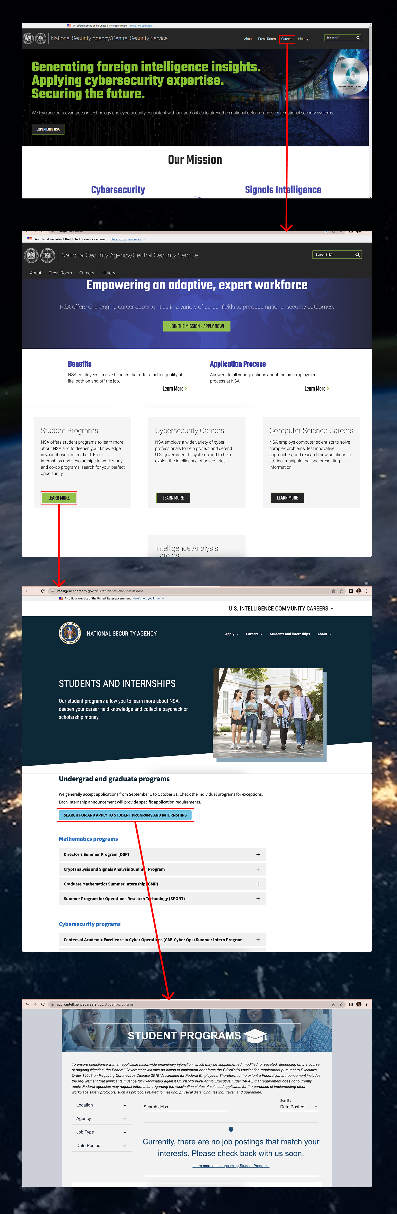
The wireflow made the long internship path visible
Following the Alexander Devi proto-persona showed how the path moved from NSA.gov to Careers, then into an external intelligence-careers site before reaching the Student Programs application experience.
The pattern was structural: clearer paths, clearer controls, and better-organized navigation mattered more than a visual refresh alone.
MAIN INSIGHTS
What the research supported
01
Navigation was the central problem
Across the research, navigation structure kept emerging as the common thread.
02
The internship path exposed deeper friction
Careers was straightforward to reach, but finding Student Internship opportunities and continuing toward the application page was less direct.
03
Information architecture needed consolidation
During card sorting, duplicate and unnecessary navigation terms showed where the information architecture needed consolidation.
04
Mobile needed its own navigation solution
Device evaluation showed that the desktop navigation pattern did not translate cleanly to smaller screens.
FROM INSIGHT TO DECISION
How the findings changed the design
The redesign decisions were shaped by usability findings, heuristic evaluation, card sorting, and prototype feedback.
01
Finding
Users needed a clearer route through Careers and Student Programs
Design Response
Reworked the navigation to make the Careers pathway clearer, with Student Internship access treated as a visible destination rather than a buried option.
02
Finding
Duplicate and unnecessary keywords created confusion
Design Response
Removed or merged repeated navigation terms and reorganized the sitemap into clearer categories such as About, History, Press Room, Careers, and What We Do.
03
Finding
Buttons and page state were not always obvious
Design Response
Made interactive elements more visually distinct, clarified titles and page location, and provided a clearer way to return home.
04
Finding
The desktop experience did not translate cleanly to mobile
Design Response
Created a mobile-friendly navigation system, removed unnecessary elements, and adapted interactions to smaller screens rather than relying on desktop behavior such as hover states.
What this shows: the team identified specific navigation problems, reorganized the structure around them, and used usability feedback to refine the prototype.
EXPLORE THE WORK
See the final prototypes
Homepage prototype
Explore the redesigned desktop homepage and navigation system in Figma.

Mobile prototype
Explore the mobile homepage and navigation solution built for smaller screens.
Style Guide
Explore the color system, typography, button states, and visual rules used across the redesign.
