


TIMELINE
2023
ROLE
UX/UI Designer
TYPE
Small Business Website Redesign
TOOLS
Figma • Figjam
TEAM
Yarisel • Sean • Madi • Krissalys • Clariss
OVERVIEW
Snapshot
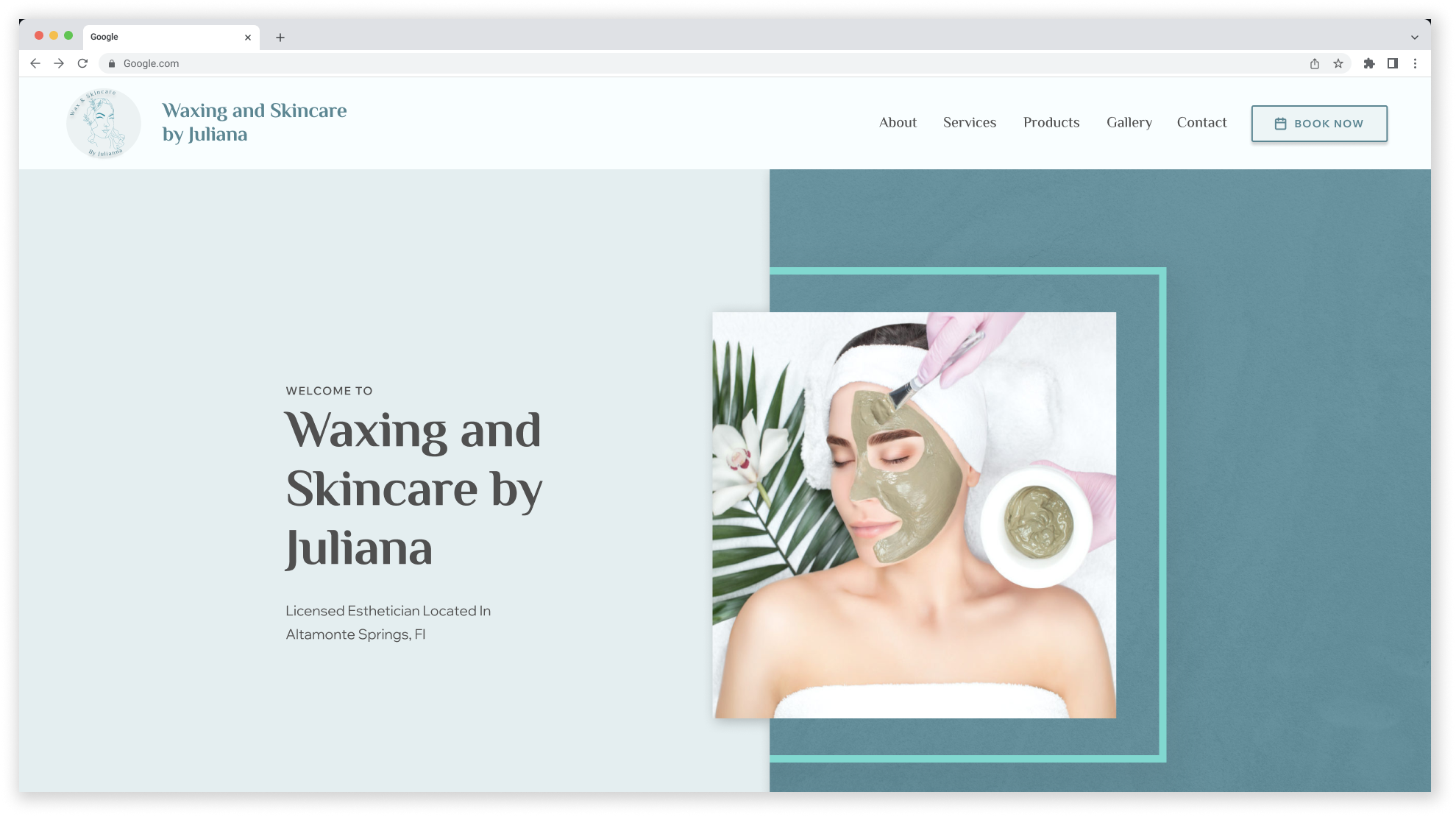
A team website redesign for Waxing & Skincare by Juliana focused on clearer service information, a more welcoming self-care experience, and a simpler path from research to booking.
GOAL
Improve service discovery, clarify service and pricing information, simplify the booking path, and create a more welcoming experience for a wider range of users.
DESIGN STACK
Figma
FigJam
Miro
Trello
Google Forms
Zoom
DESIGN RESPONSE
• Reorganized the site map around services and pricing
• Connected service browsing to a more direct booking flow
• Created a more cohesive and welcoming visual direction
• Structured service pages to support easier comparison and understanding
RESEARCH FINDINGS
• Feedback called for clearer service explanations
• Feedback favored a simpler site with less searching
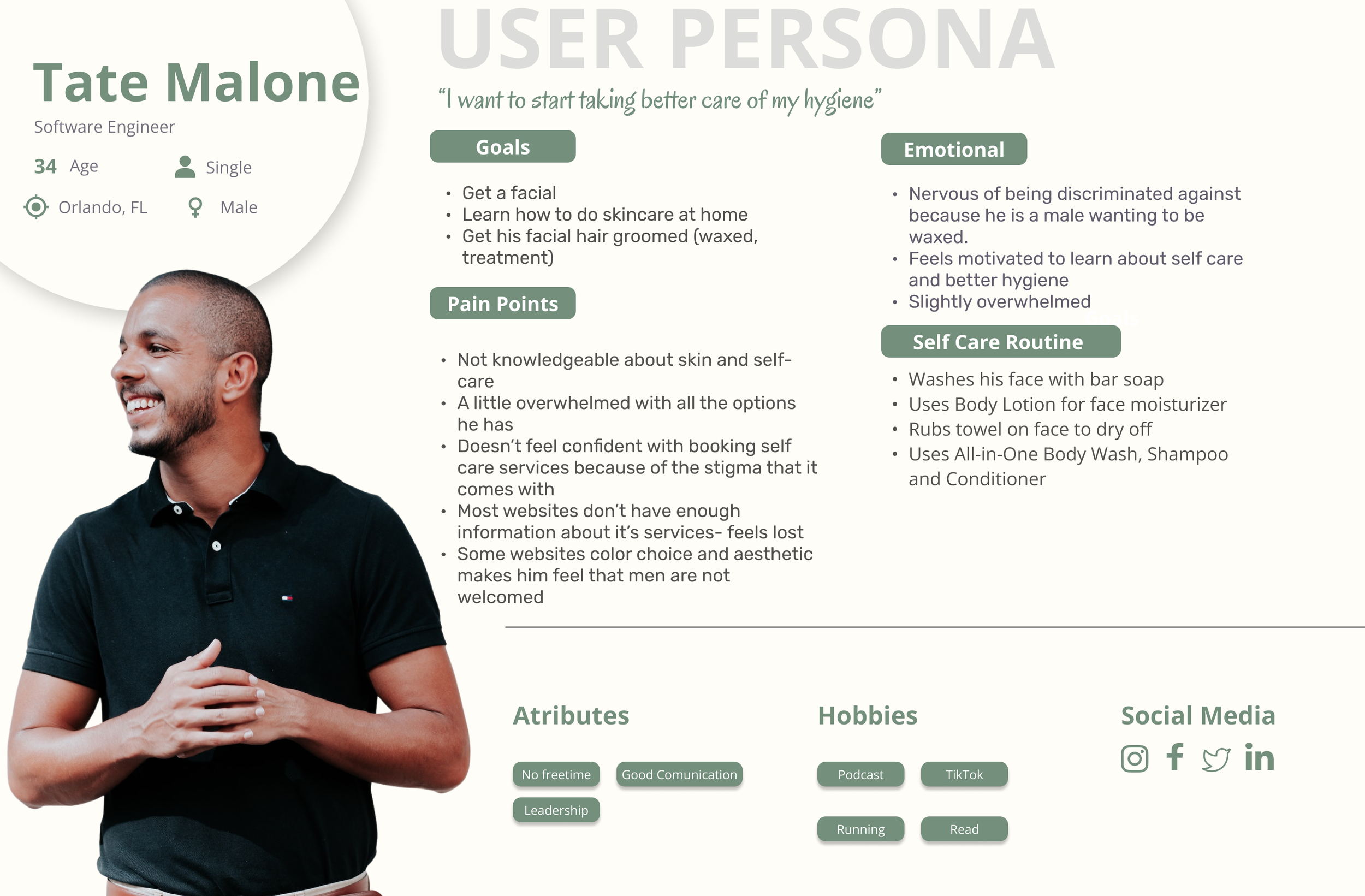
• The persona highlighted overwhelm around service options and booking
• Visual choices raised questions about who the experience was welcoming
6
JOURNEY STAGES
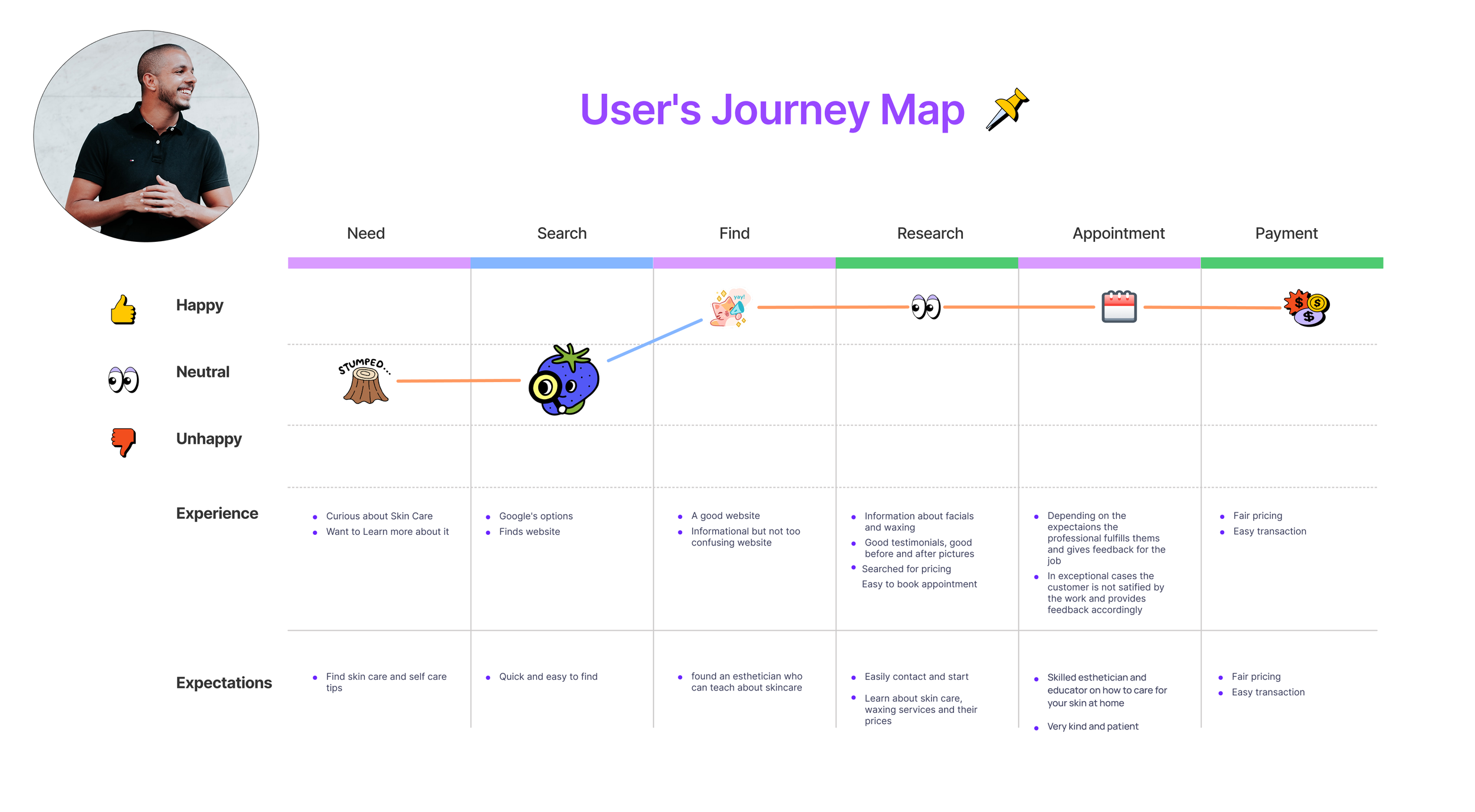
Need, Search, Find, Research, Appointment, and Payment shaped the mapped journey.
4
PRIMARY NAV AREAS
Home, About, Services & Pricing, and Shop formed the main navigation.
Inclusive
PERSONA CONSIDERATION
Tate’s persona raised the need for a self-care experience that also felt welcoming to male customers.
THE PROBLEM
The Challenge
The research pointed to a need for clearer service information, better guidance around available options, and a booking path that was easier to understand.
The friction appeared in how services were explained, how much information was available before booking, and whether the site’s visual direction felt welcoming to a wider range of customers.
01
Services needed better explanation
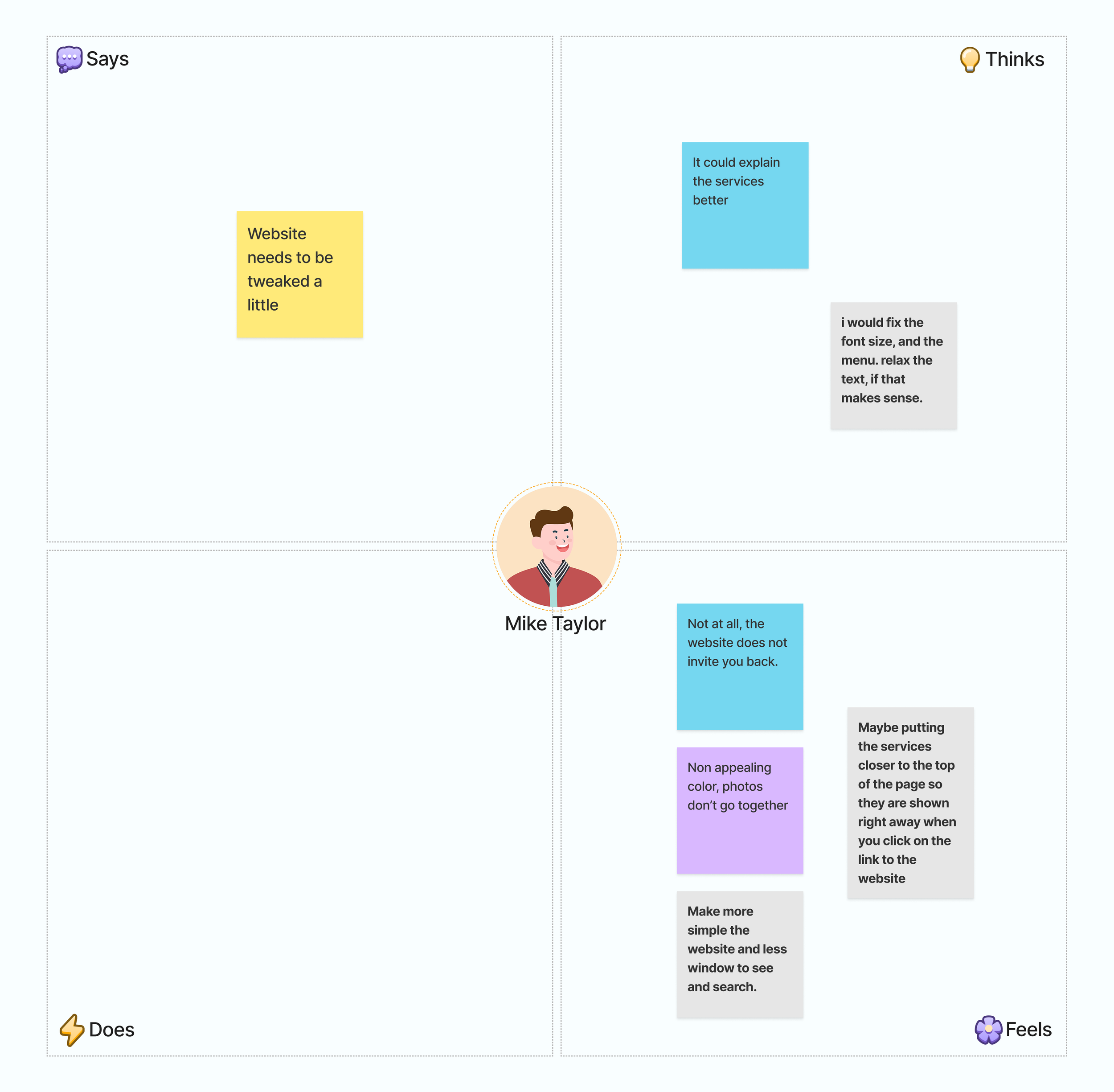
The empathy map directly identified a need for clearer service descriptions.
02
The visual direction lacked consistency
Research feedback described the colors and photos as not working together.
03
Feedback called for a simpler website
The empathy map called for fewer windows and a clearer way to see and search.
04
Inclusivity mattered
Tate’s persona raised concerns that some visual choices could make male customers feel less welcomed.
The core problem: customers needed clearer service information and a simpler path from curiosity to booking, without feeling overwhelmed by the experience.
THE PROBLEM
The Challenge
Fertility rates are falling across many countries, including places investing heavily in policies meant to encourage people to have children. But the numbers raised a bigger question for me: if governments are spending more, why are fertility rates still dropping?
The challenge was to look past total spending and understand what support looks like. That meant comparing childcare costs, cash benefits, tax relief, family services, and reproductive rights to explore why parenthood can still feel difficult or out of reach, even when support exists on paper.
The core question: Are governments supporting what families need, or are they trying to fix falling birth rates without addressing the pressures behind them?
-
More public spending did not consistently align with higher fertility.
-
Benefits came in different forms, including cash, childcare, education, services, and tax relief.
-
South Korea's public spending data was incomplete, so it had to be flagged and handled carefully.
-
Regression alone did not explain much, so I used clustering and time series analysis to look for patterns the regression missed.
“Finding the right service should not require digging through the website first.”
— RESEARCH INSIGHT
RESEARCH PREPARATION
Building the problem from research
The research combined stakeholder input, surveys, competitive review, personas, journey mapping, and information architecture to understand what people needed before choosing a service and booking.
Persona development
Personas explored customers who felt uncertain, overwhelmed by service options, or less represented in traditional self-care experiences.
User journey mapping
Mapped the path from initial need through search, research, appointment, and payment.
Empathy mapping
Captured reactions to the existing experience, including unclear service explanations, non-cohesive visuals, and too much complexity.
Information architecture
Reorganized content into clearer primary navigation, with Services & Pricing as the central route to detailed service information.
Research pattern: the problem was not a lack of content everywhere. It was making the most useful information easier to find when people needed it.
HOW I WORKED
Design Approach
The redesign moved from understanding the user journey to simplifying the site structure, then into visual design and prototype refinement.
01
Understand the user
Used stakeholder input, survey feedback, competitive research, and persona work to identify where the existing experience was falling short.
02
Map the journey
Mapped the customer journey, user flow, and content structure from service discovery through booking and payment.
03
Rebuild the structure
Created a simpler sitemap and service hierarchy around Home, About, Services & Pricing, Shop, and Book Now.
04
Prototype the experience
Turned the revised structure, visual direction, and service content into wireframes and interactive prototypes.
The flow connected service discovery to booking.
The user flow mapped the path from browsing services through booking details and confirmation.
INFORMATION ARCHITECTURE
WHAT THE RESEARCH REVEALED
Four artifacts that shaped the redesign
Across the research, the same issues kept meeting in one place: understanding the services, finding the right information, and getting to booking.
Click for a closer look
KEY FINDING 01
The persona showed where self-care could feel less welcoming
Tate Malone wanted better self-care guidance but felt overwhelmed by options and worried that some waxing websites were not designed to welcome male customers.
Click for a closer look
KEY FINDING 02
The empathy map pointed to clarity and simplification
Feedback called for better service explanations, simpler navigation, fewer windows to search through, and a more cohesive combination of color and imagery.
Click for a closer look
KEY FINDING 03
The journey map connected discovery to booking
The journey moved from Need to Search, Find, Research, Appointment, and Payment, showing where service information, pricing, and booking fit into the experience.
Click for a closer look
KEY FINDING 04
The sitemap simplified where information lived
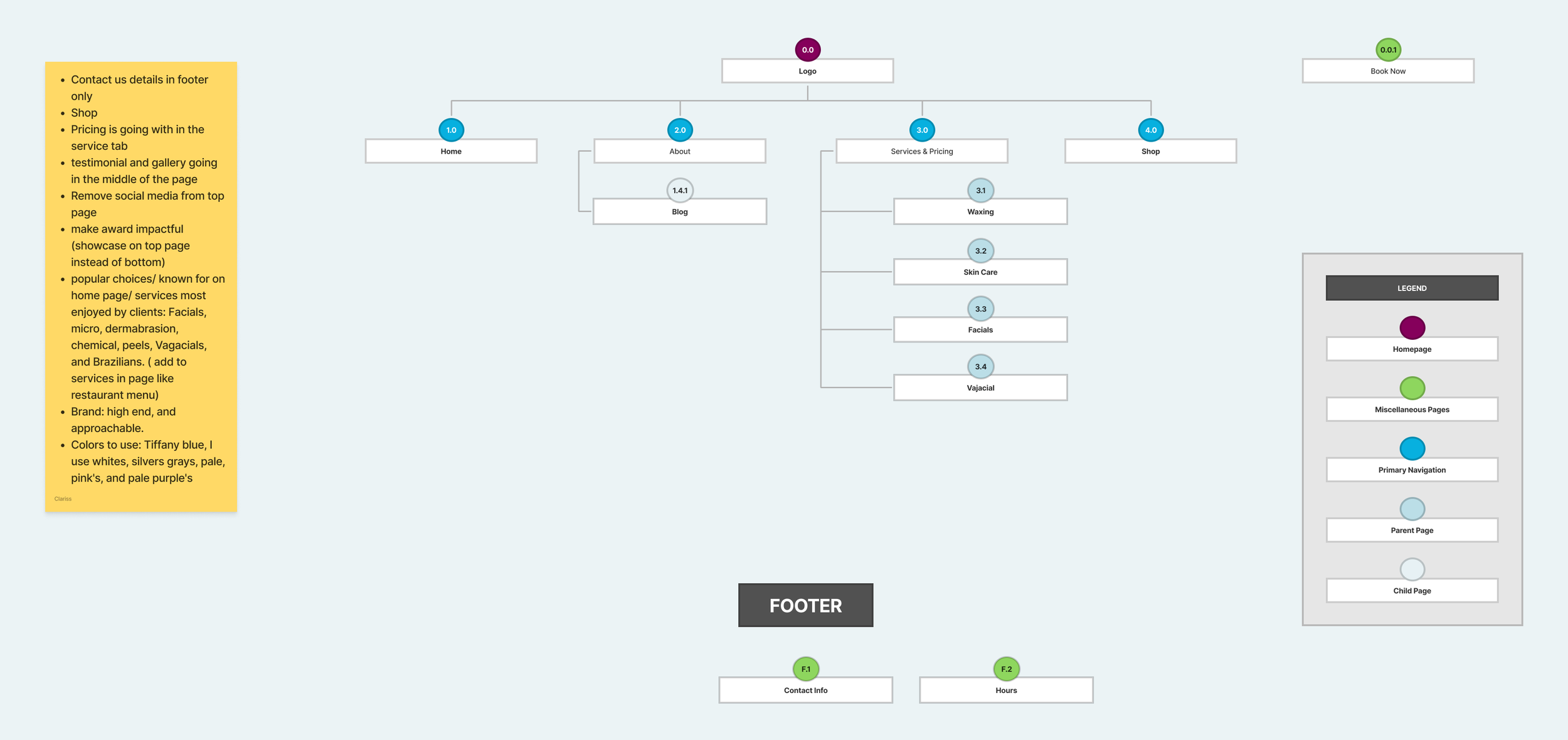
The sitemap centered the main navigation around Home, About, Services & Pricing, and Shop, while Book Now remained a separate action. Waxing, Skin Care, Facials, and Vajacial were grouped under Services & Pricing.
The structural pattern: users needed less guessing before booking. Clear service descriptions, simpler hierarchy, more welcoming visuals, and a direct Services & Pricing path shaped the redesign.
MAIN INSIGHTS
What the research supported
01
Service clarity came before booking
People needed to know what a service was, what it included, and what it cost before they felt ready to book.
02
Visual tone affected who felt welcome
The persona and competitive research showed that overly feminine visuals could make male customers feel like the experience was not designed with them in mind.
03
Simpler navigation was a clear research priority
Across the research, the same pattern kept showing up: fewer windows, clearer categories, and more obvious paths were what people were asking for.
04
Booking needed to be supported by context
By the time someone reached Book Now, they had already been researching services, comparing options, checking pricing, and deciding what felt right.
FROM INSIGHT TO DECISION
The final design decisions came directly from patterns around service clarity, visual inclusion, booking, and navigation.
How the findings changed the design
01
Finding
Service descriptions needed more clarity
Design Response
Make Services & Pricing a primary navigation destination and group detailed service types underneath it so users can understand options before booking.
02
Finding
The visual direction felt inconsistent and too narrowly coded
Design Response
Use a softer, more balanced visual direction with consistent typography, imagery, and color choices that feel welcoming beyond one type of customer.
03
Finding
Users wanted a simpler website with fewer places to search
Design Response
Reduce navigation complexity, keep contact details in the footer, place testimonials and gallery content within the page flow, and remove unnecessary top-level items.
04
Finding
Booking depended on what came before it
Design Response
Bring pricing, service descriptions, testimonials, and booking access forward so people have the context they need before making an appointment.
What this changed: instead of treating the website as separate pages to clean up, the redesign treated service discovery, visual direction, and booking as one connected experience.
EXPLORE THE WORK
See the final prototypes
Note: After the collaborative design phase, I continued refining the prototype independently using additional feedback and testing.
Juliana Medical Spa Desktop
Explore the final desktop experience in Figma.
